We may receive a commission when you use our affiliate links. However, this does not impact our recommendations.
 Create artistic signs the old-fashioned way.
 Create artistic signs the old-fashioned way.
You can churn out lettered signs by the dozens with a router and a set of letter templates or produce them by the hundreds with a CNC machine. So why use any other method? Because routing with letter templates limits font choices and letter sizes; and CNC equipment is costly for the average Joe and comes with a difficult learning curve, especially if Joe isn’t computer-savvy.
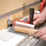
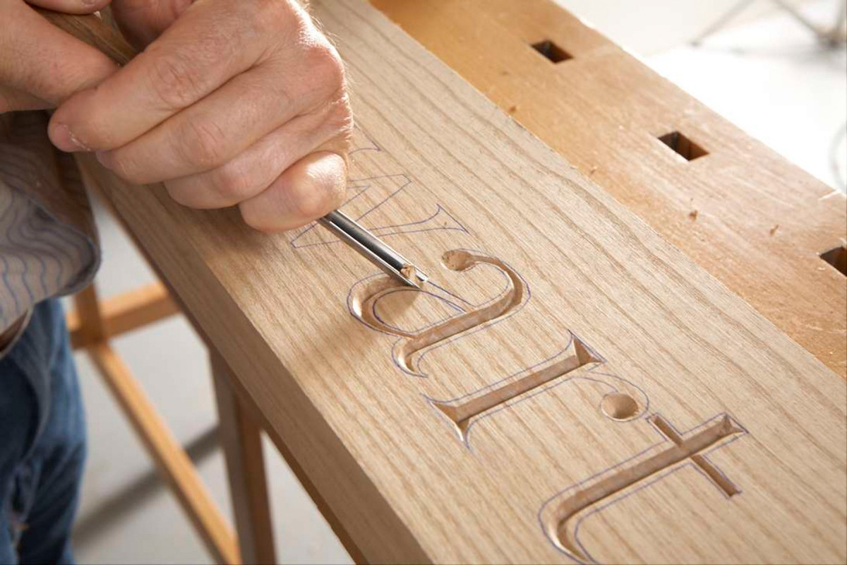
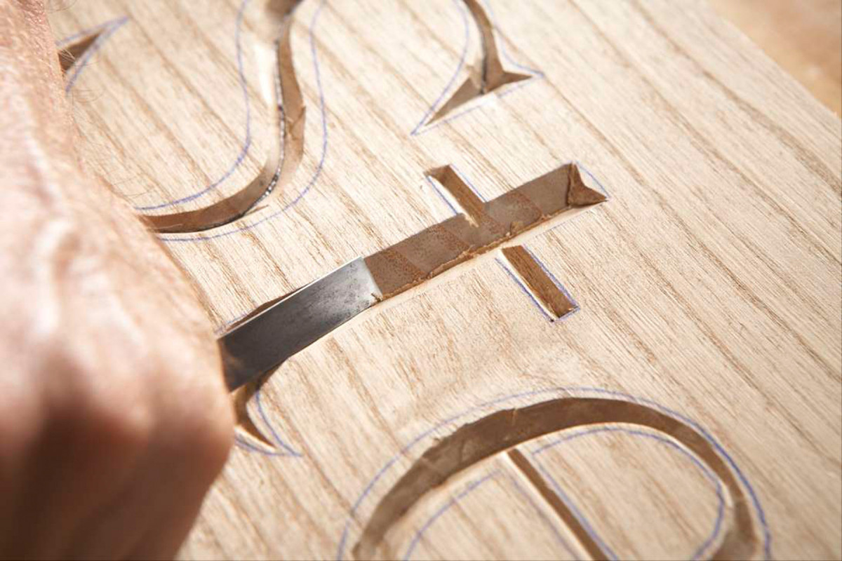
Choose a gouge to carve the letters’ outside curves by matching its profile with the centerline of the letter. The outside curves will be similar enough that one gouge will work for most of them.
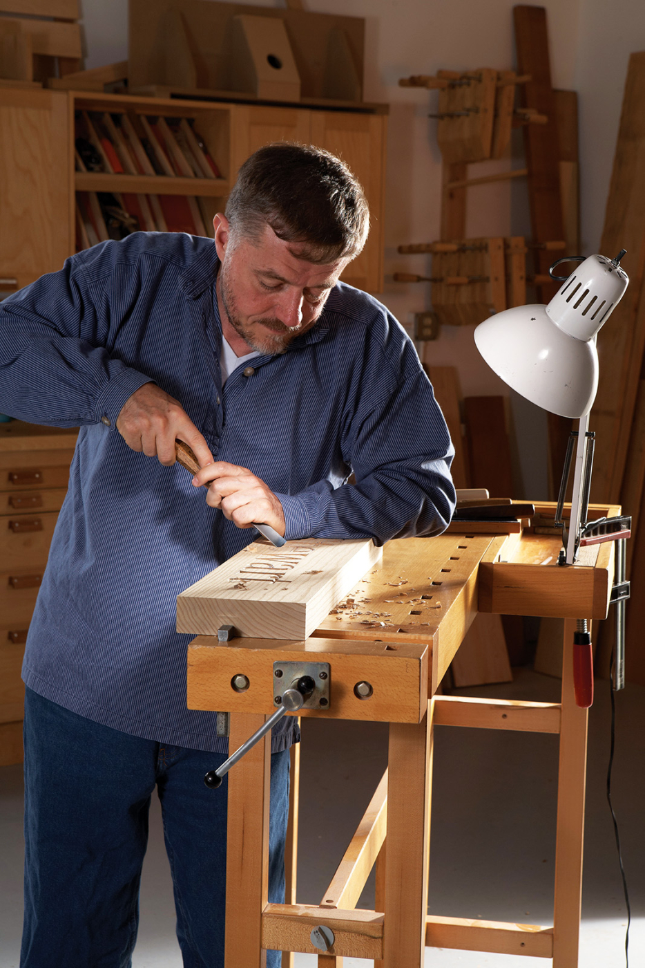
I prefer to carve lettered signs the old-fashioned way, by hand. OK, this method has drawbacks, too. Each carving tool costs nearly twice as much as a set of letter templates, and learning to sharpen and use carving tools takes hours and hours of practice. But this method allows you to create signs without mind-numbing noise or clouds of dust. You can carve letters in any style and add nuances to create depth and interest that’s impossible with a router. And you’ll have the ultimate satisfaction that comes from mastering a time-honored woodworking skill and using it to create unique works of art.
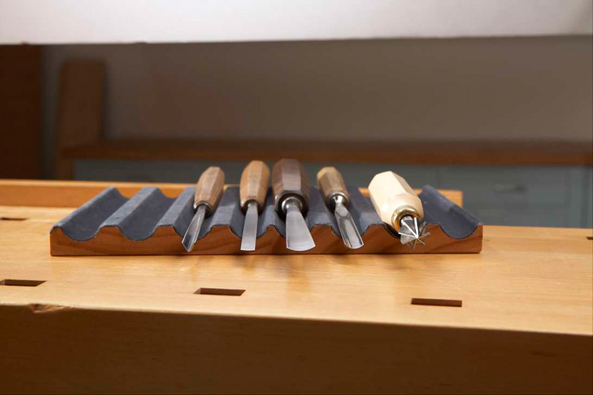
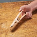
Only five tools are required to carve the 3″ Georgia font shown in this story. Left to Right: #12-8 V-gouge, #2-5 gouge, #5-16 gouge, #7-10 gouge, Countersink. • A #12-8 V-gouge to establish the center of each letter. • A #2-5 gouge to carve the straight shoulders and inside curves. • A #5-16 gouge to carve the outside curves. • A #7-10 gouge to match the tight curves found in some letters. • A hand countersink to shape dots and rounded ends of letters. (See Fig. B to learn about carving gouge terminology.)
In this story I’ll demonstrate the techniques I use to carve lettered signs. I’ll also show how to choose letter styles that will be easy to carve and pieces of wood that will carve easily. The one thing I can’t show is the hands-on experience that it takes to become familiar with carving tools and master their use. So if you’re inspired to give letter carving a try, I recommend that you take lessons to learn basic skills and sharpening methods.
Choosing stock
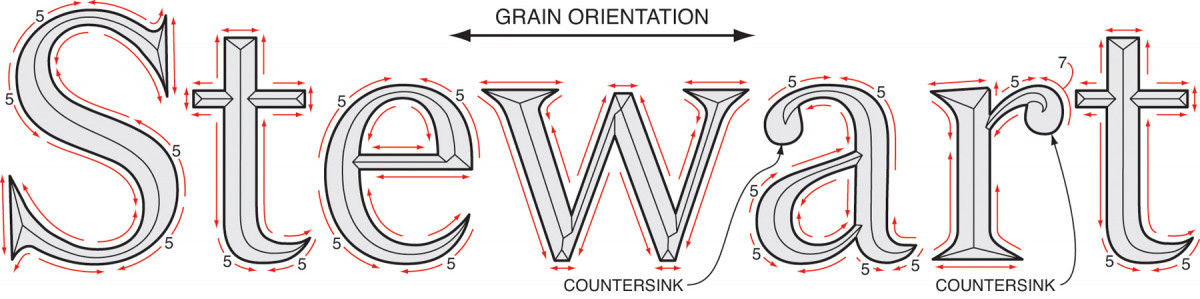
Fig. A) Directions for carving the beveled shoulders. Incised letters are v-cut. Take care to follow the grain when you define the letters’ outside edges and shape their beveled shoulders by carving in the direction of the red arrows. Make all cuts with a #2 gouge, unless noted.
The orientation of the grain and the type of wood are the most important considerations when choosing stock for hand-carved lettering. Surfaces with straight grain are the easiest to carve, so look for quartersawn or riftsawn boards. Straight grain running behind the lettering also helps to make the completed sign look straight.
Cedar, redwood, cypress, teak, genuine mahogany and catalpa are good choices for signs that will hang outdoors. For interior signs, basswood is an excellent choice, especially for first-timers. Oak, ash, walnut and maple are more difficult to carve.
Choosing a font
Today’s computers make it easy to compare letter styles. To see how any font will look on your sign, open a document, enter the words that will appear and highlight the phrase. Then open the font window and click on the font you want to see. Presto! Click again to compare bold and italic versions. To compare fonts, just re-enter the phrase on a new line, highlight it and select the second font. Use the “font size” window to enlarge the phrases for a better view.
Once you’ve chosen a letter style and size, print out the phrase to create a full-size template. If the lettering is too large or long for your printer to produce, head to a copy center with a large-format printer.
Tape the template to the blank and use carbon paper to transfer the letters. The transferred lines must be clean and crisp. Another option is to tack on the template using non-permanent spray adhesive and carve through the paper. Be sure to completely remove the adhesive when you’ve finished carving.
Choose a font that’s legible. I find fonts with serifs (those little wings on the ends of letters) are easier to read than sans serif fonts. Complex font styles such as Lucida Blackletter are double-trouble—hard to read and tough to carve.
The key to determining whether a font will be easy to carve lies in the letters. Most will have consistent stems and curves in both upper and lower case, so you’ll be able to use the same tools and techniques to shape them all.
However, almost every font will include some letters with eccentric shapes that require additional tools or carving methods. Studying these unusual letters is a good way to determine how challenging a font will be to carve. For example, letters such as a, e, f, g, j, r and s often have different curves (tighter or more elongated) than the other letters. Letters with slanted stems require following the grain, because its direction changes on each side of every v-carved shoulder. Letters that exend below the baseline can cause layout problems.
Sometimes, slightly modifying the letters is all it takes to solve the problem. I often make the ends of serifs pointed, for example. But in general, the font with the fewest unusual letters will be the easiest to carve. Georgia—the font shown in the how-to photos—is both legible and uniformly shaped, making it an excellent choice for one’s first lettered sign.
Choosing carving tools
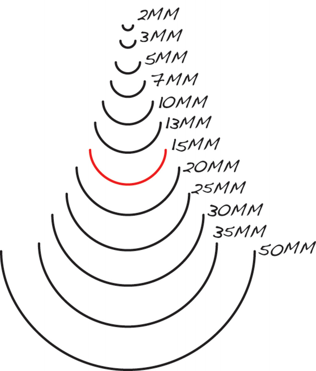
Fig. B) Carving gouge terminology. #9 sweep.
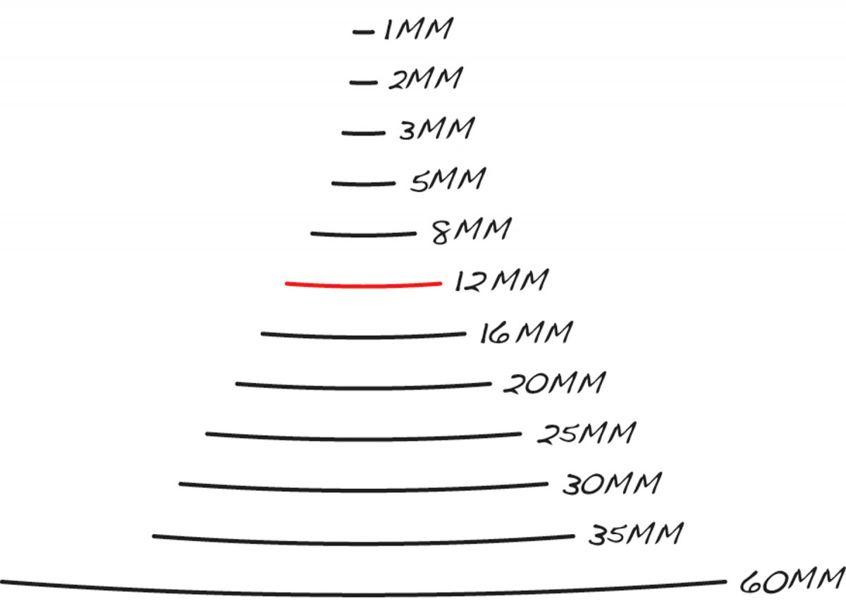
#2 sweep) Each carving gouge is named according to the sweep of its cutting edge (#1–#12) and its width (in millimeters). The two gouges highlighted in red are called a #2-12 and a #9-15, respectively. These two drawings show profiles of 24 different carving gouges.
Carving gouges come in a bewildering array of shapes, sizes and numbering systems. To keep things simple, all the tools used in this story follow the Swiss numbering system. Within this system, each gouge is named according to its curve (called the sweep) and width (Fig. B).
Most carvers use a #12 (V-groove) gouge to establish the center of each letter, a skew chisel to shape the straight bevels, and gouges of various sizes to define the inside and outside edges and shape the curved bevels.
My method, honed by feedback from students in my carving classes, simplifies the process and limits the number of carving tools.
I use a #2 gouge instead of a skew, because my students find that it’s easier to control. And I stick with the #2 gouge to shape as many of the inside edges, bevels and curves as possible.
To find the correct gouges to define the outside edges and shape the outside bevels and curves, use the centerline of each letter. One gouge will work for most of these curves, but a few additional gouges will probably be required for letters with unusual curves. I pay particular attention to the letters g and s. They’re typically the hardest to carve, because their curves have smaller radii than the other letters. Another excellent reason for choosing Georgia is that carving it requires only five tools. The techniques shown in the how-to photos will allow carving all the letters in Georgia and many other fonts.
It’s important to note that changing the size of the font will change the gouges required to carve the curves. For example, the #5-16mm gouge I use to carve most of the outside curves in the 3″ Georgia letters shown here won’t match the outside curves in 5″ Georgia letters.
Rough out each letter
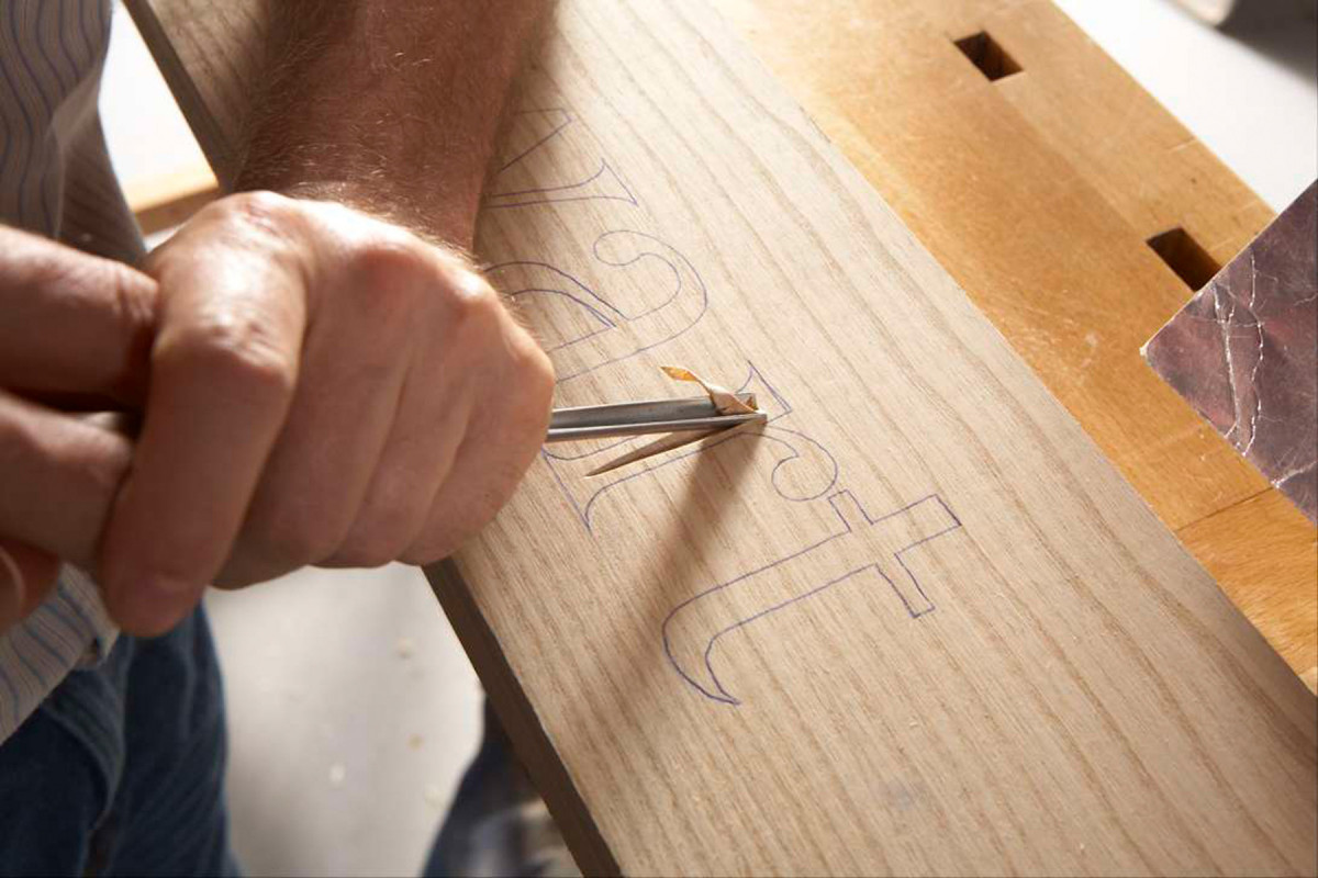
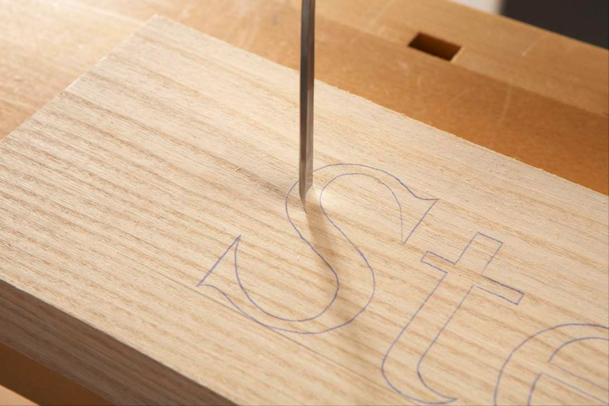
1. Rough out each letter by carving a centered groove. On straight sections, gradually deepen the cut to full depth as you go. Change direction and carve back full-depth to the starting point.
Start by using the #12-8 V-gouge to establish the depth and center of each letter. The depth varies according to the letter’s width—its widest points will also be its deepest. On straight sections, mark the transition between the stems and serifs as necessary.
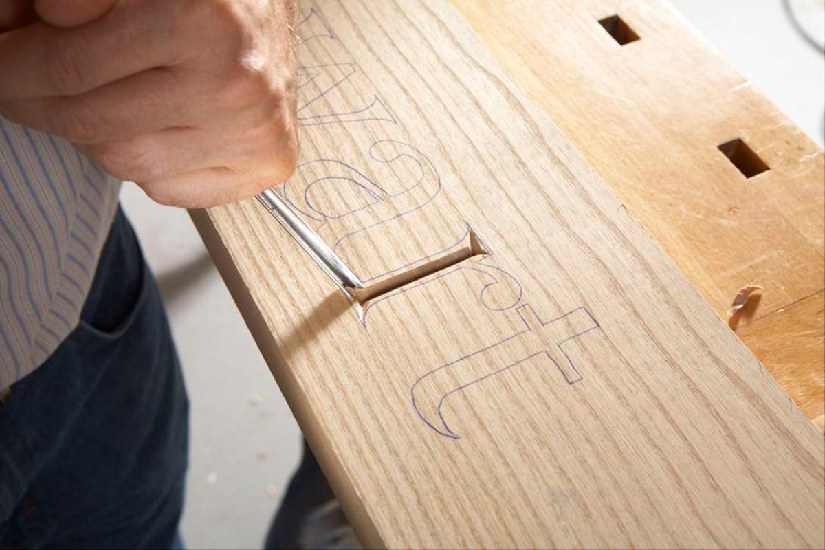
2. Rough out the serifs by cutting in from the corners. Start shallow and deepen the cut to match the center groove’s depth.
Then carve a centered groove between them at the full depth of the gouge, which is about 2/3 the height of its v-shaped blade (Photo 1). Grain direction is a minor factor when using a V-gouge. Finish by roughing out the serifs (Photo 2).
3. Square the ends of short, narrow stems with the #2 gouge. Note that the grooves in narrow portions of letters are less deep than the grooves in wide portions.
In narrow stems, such as the cross on a t or between the angled legs of a capital A, the grooves are less deep. The sweep on a #2 gouge is so slight you can use it to square the free ends of these stems (Photo 3).
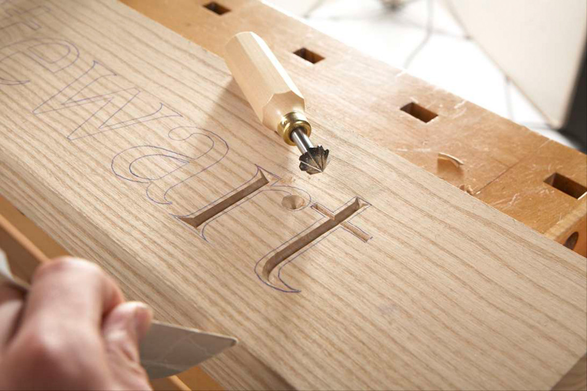
4. Carve the rounded ends of letters such as r and a and dots for letters such as i and j with a hand countersink. Center the countersink on the tightest radius of the rounded portion.
Why bother to sharpen a straight chisel when a gouge that you already plan to use will do? Another neat trick is to use a hand countersink to create rounded details (Photo 4 and Sources). You’ll probably have to slightly alter the carved bevel to match the countersink’s bevel where the two bevels meet.
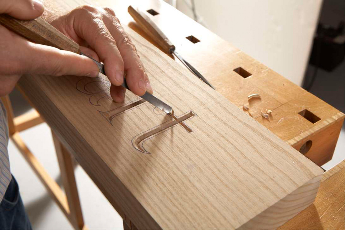
5. On curved sections, a letter often narrows to a point. Adjust the groove’s width and depth to match. Work from shallow to deep to create wide sections, then work toward the narrow ends.
On curved sections, carve at full depth in the widest part and gradually become shallow as you move toward the narrower parts (Photo 5).
6. Carve letters with continuous curves and changing widths in multiple steps, rather than one continuous, undulating pass.
To create fluid curves that remained centered between the layout lines, it’s sometimes better to work in stages (Photo 6).
7. The goal is to center the bottom of the groove inside each letter. The top edges of the groove don’t matter because they’ll be pared away in the next step.
The primary goal of this process is to perfectly center the bottom of the groove inside each letter (Photo 7).
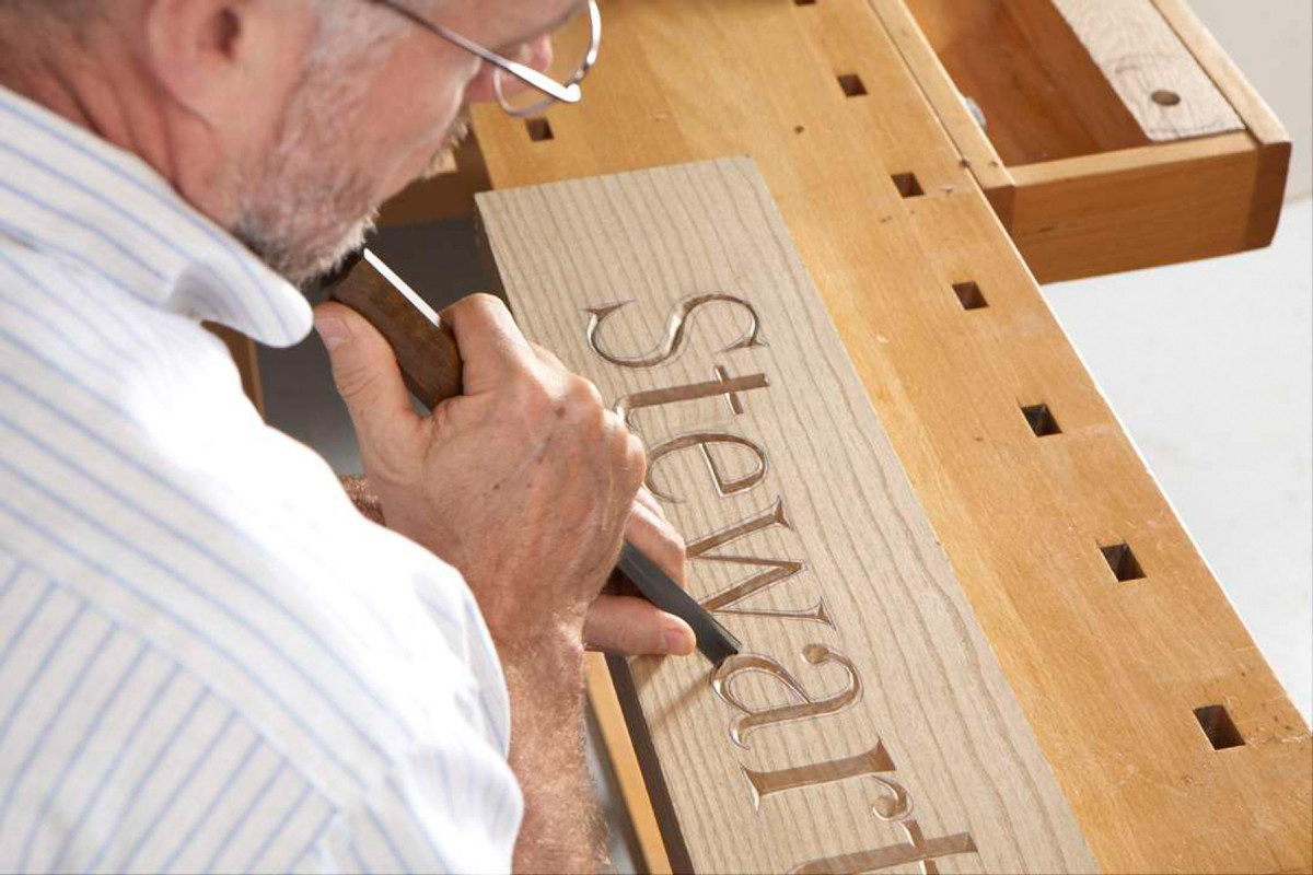
Carving
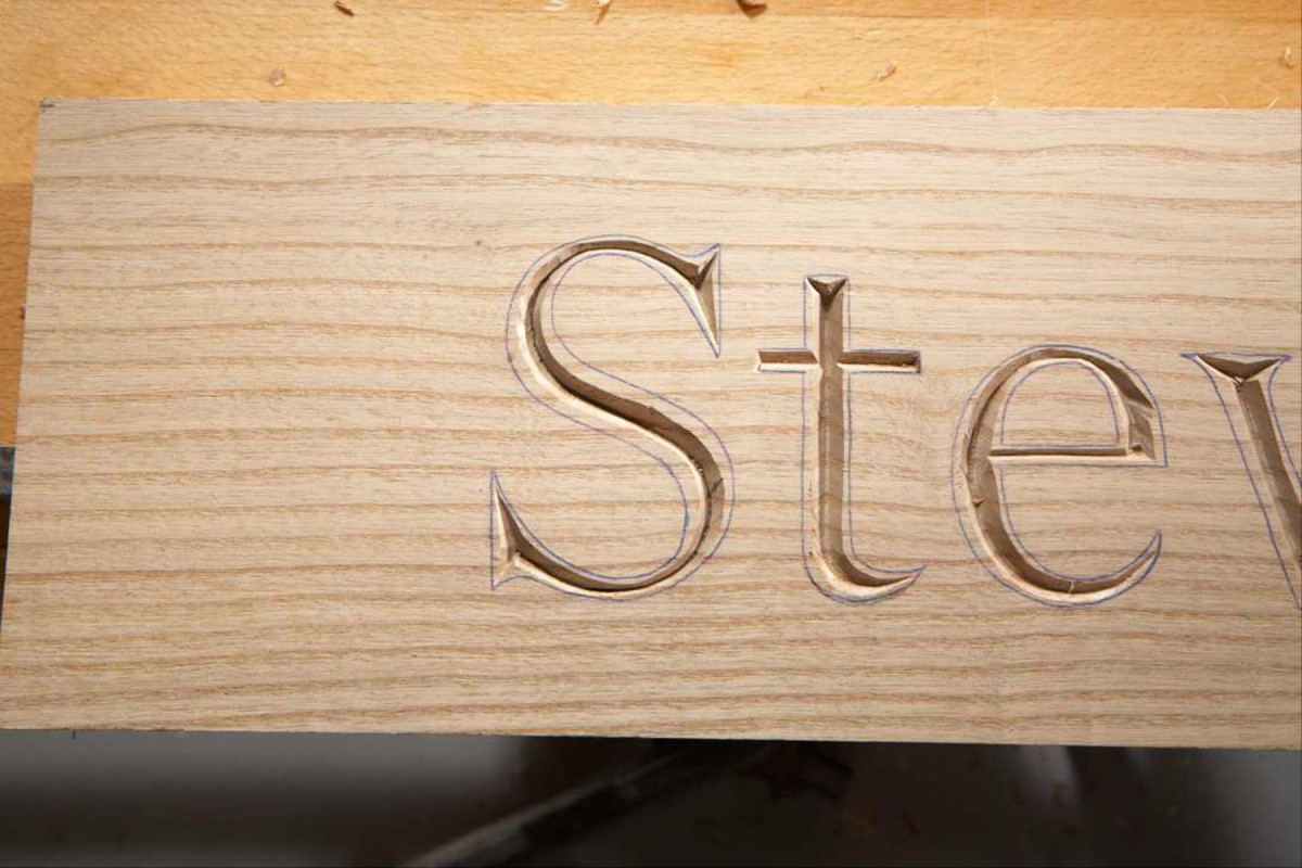
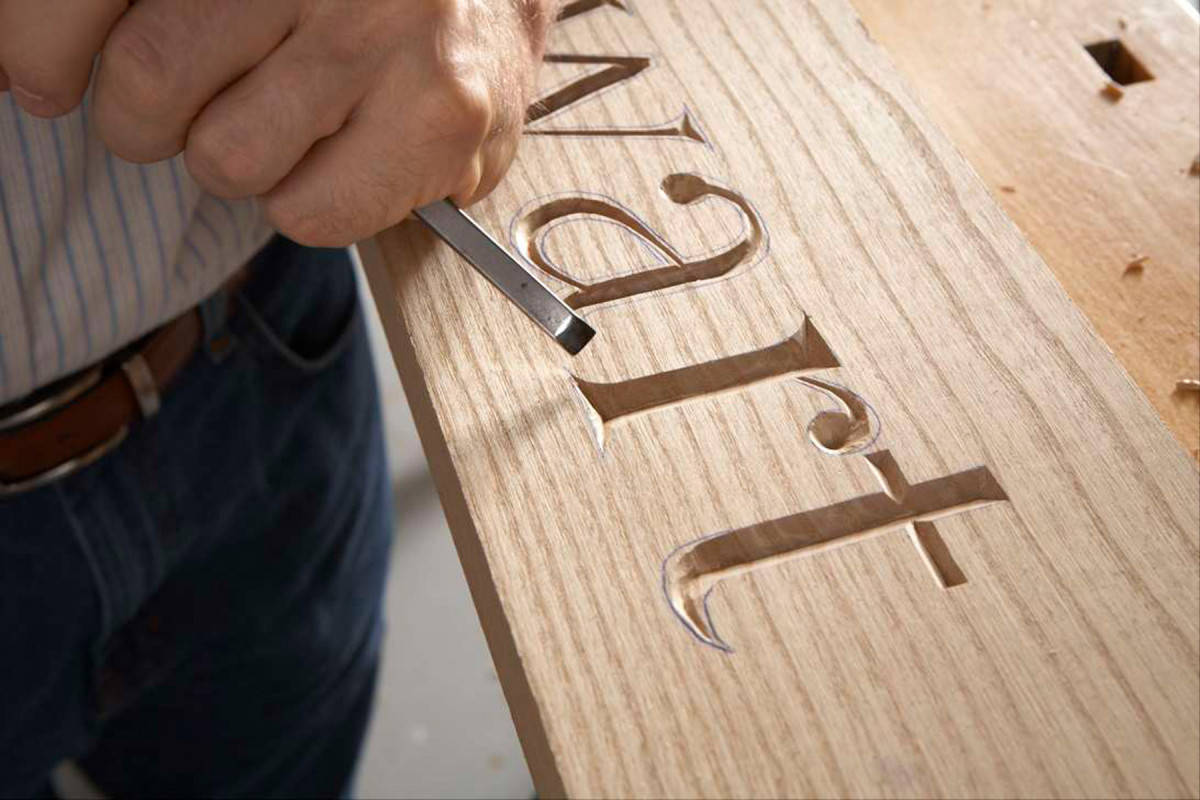
8. Carve both shoulders to create each V-cut letter. Use the #2 gouge to carve the straight sections. Ride the groove’s bevel to keep from digging in at the bottom. At the top, pare to the layout line.
Incised letters are v-cut from the bottom of the groove to the layout lines. It’s important to follow the grain when you make these finishing cuts (Fig. A).
9. Make a final cleaning pass to remove the debris at the bottom of the groove that’s left by properly riding the bevel in the previous step.
Start by carving the straight sections (Photo 8). Create each shoulder by making several shallow passes with the #2-5 gouge. Hold the gouge at approximately 45°, with its leading edge above the wood and its side resting on the beveled v-groove. Then let the bevel guide the cut. Make sure to keep the tip of the gouge away from the bottom of the groove, as overcutting it will ruin the letter’s centerline.
10. Hold the #2 gouge bevel-side-up and use its shallow sweep to help shape the serif’s curved corners. Use the same gouge bevel-side-down to carve their straight ends.
Riding the groove’s bevel also helps you control the gouge while paring the shoulders to the layout lines. Always keep the leading edge of the gouge above the wood. Make a final cleaning pass at the bottom of the groove (Photo 9). Then use both sides of the gouge to carve the serifs (Photo 10).
Use the #5-16 and #7-10 gouges to define the outside edges and shape the outside bevels and curves in this 3″ Georgia font. Use the #7-10 gauge to shape the small-radius curves found on five lower case letters, f, g, j, r and y. (The letter r appears in the photos, but the other letters don’t.) Use the #5-16 for everything else.
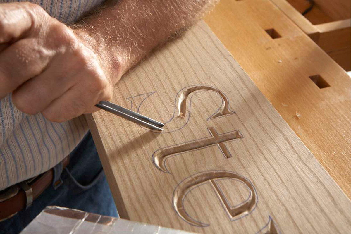
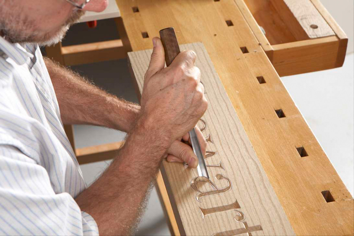
11. Use the #5 gouge to carve the outside curves. Cutting straight in from the edge to the center usually does the trick. But a sliding, rotating motion is sometimes necessary to follow an unusual curve.
Always carve with the grain during this process. Carving against the grain will cause the edges to chip or tear out. Hold the gouge at approximately 45° and cut from the edge to the center.
Some letters have elongated curves that require a slightly different technique (Photo 11). The fluid carving motion these elongated curves require takes time to learn, so practice on scrap stock until it becomes natural.
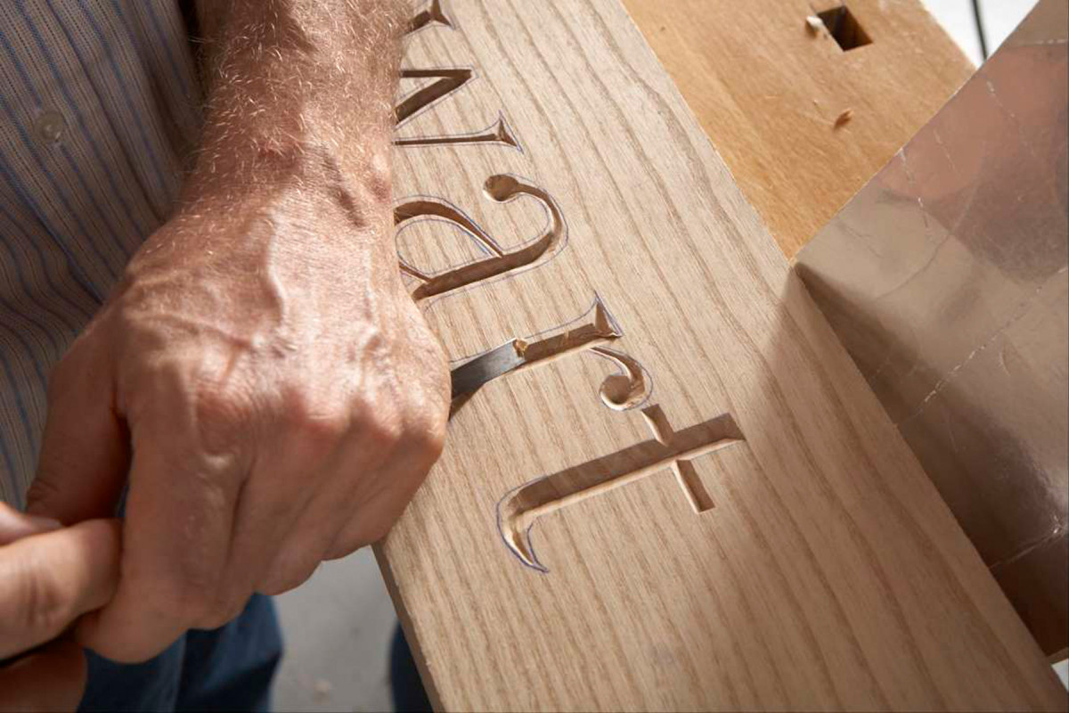
12. Use the #2 gouge to carve the inside curves. As before, complete the cut by making shallow passes, ride the gouge against the bevel, keep the leading edge above the wood, and follow the grain.
Return to the #2 gouge to shape the inside curves (Photo 12). Carve with the grain and use the same techniques used to carve the straight sections.
Jock Holmen is a carver from Burnsville, MN.
SOURCES
• Woodcraft, woodcraft.com, 800-225-1153, Pfeil #2-5mm Gouge, #05B06, $32.99; Pfeil #7-10mm Gouge, #05E03, $36.99; Pfeil #5-16mm Gouge, #05D06, $36.99; Pfeil #12-8mm V-Gouge,
#05T85, $34.99.
• Lee Valley Tools, leevalley.com, 800-871-8158, Hand Countersink,
50K62.01, $19.50.
Here are some supplies and tools we find essential in our everyday work around the shop. We may receive a commission from sales referred by our links; however, we have carefully selected these products for their usefulness and quality.