
We may receive a commission when you use our affiliate links. However, this does not impact our recommendations.
There’s something very graphical about the design of the Mid-Century Modern Bookcase I built for the October 2015 issue of Popular Woodworking Magazine. Viewed head on, the arrangement of dividers and shelves suggests a grid-based page layout. Although the analogy falls a bit short (the short divider is placed in such a way to form irregularly-spaced columns), I can imagine a graphic designer trained in the International Typographic Style applying a layout grid to arrange the shelves and dividers in the case. And my imaginary designer could have used that same grid to divide the interior of the case in any number of ways, suggesting the grid as an alternative to other design approaches, like the golden ratio. And since the grid is variable, it invites different paths for customizing the design.
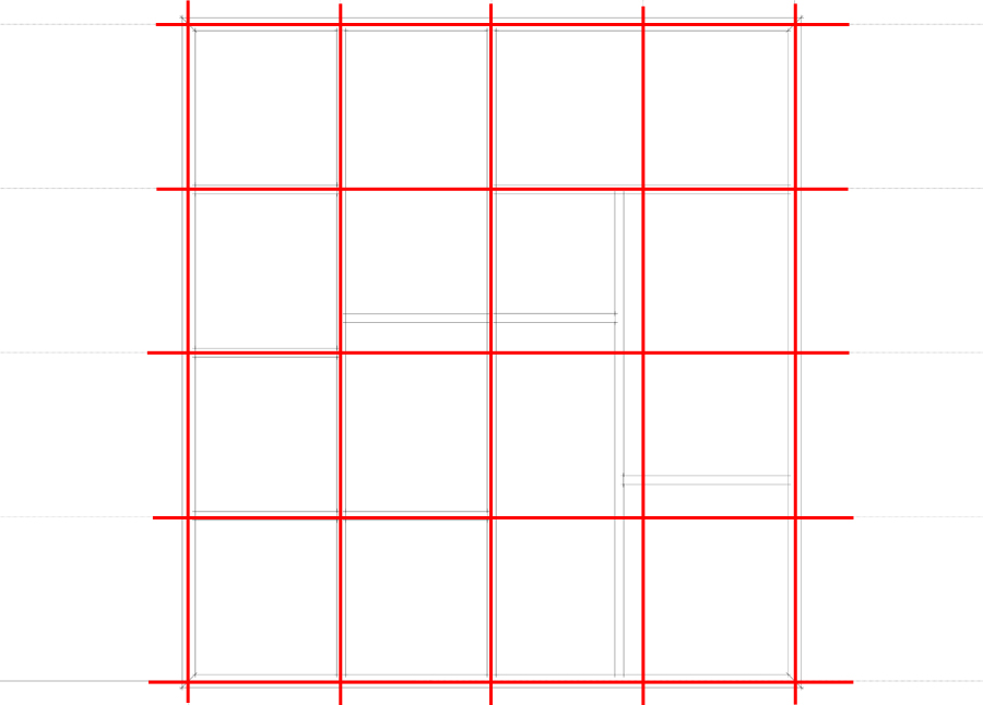
The dividers form an imperfect grid, but their arrangement suggests how a grid might be adopted for case design.
The Grid Only Matters from the Front or Back
Larger display items can be accommodated by adding depth to the case.
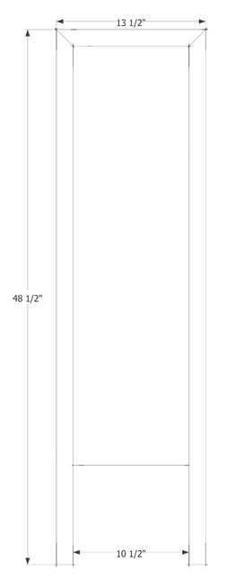
At 10-1/2”, the case depth will accommodate many items, but if its intended purpose is for display, some additional depth may be useful. This is an easy adjustment to make: simply add depth to all case pieces and length to the top rails of the leg assemblies. An extra inch and a half yields a 12”-deep case.
On Its Side

Changing the orientation of the dividers and eliminating a couple of rows of shelves yields a possible design for a Modernist console. Varying the height of the legs makes the console a stand or sideboard.
The arrangement of dividers and shelves would function just as well were the case oriented horizontally rather than vertically and the legs shortened. Eliminate a row or two of the turned grid, and the effect is amplified. With some additional depth, the resulting console could serve as a unique take on a Modernist widescreen TV stand or sideboard.
Split Grid
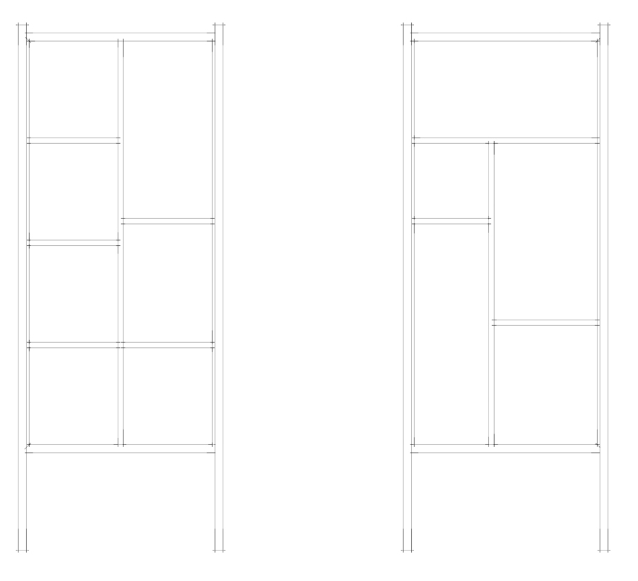
Splitting the divider arrangement in two produces two narrower cases.
Break the basic grid into two two-column layouts, and you have a matched pair of narrow book cases. Because you’ve doubled the number of cases, this modification is a little more complex than varying the depth of the case or turning the assembly on its side, but the construction techniques remain the same: A rabbeted frame captures each side of a mitered case, with internal dividers joined by dadoes.
Choose Your Own Grid
The variations on the case I’ve sketched out here all rely on the same basic arrangement of dividers, but there’s no reason to limit yourself to the grid which the designer established. Instead, you can take the lesson of the grid and adopt it to your own design, whether it be an open shelf, a chest of drawers, or a cupboard.
Editor’s note: If you like the Mid-Century Modern style, check out the October issue of PWM for the step-by-step build of the bookcase (which also works well as a room divider) – but you’ll also want to dive into Michael’s new new book “Mid-Century Modern Furniture: Shop Drawings & Techniques for Making 29 Projects,” with designs from Hans Wegner, Finn Juhl, George Nelson and more.
Here are some supplies and tools we find essential in our everyday work around the shop. We may receive a commission from sales referred by our links; however, we have carefully selected these products for their usefulness and quality.