We may receive a commission when you use our affiliate links. However, this does not impact our recommendations.
Kudos to all who accepted last week’s challenge to match features of my recently completed dining table commission with the list of John Ruskin’s “moral elements of Gothic” from his magnum opus, The Stones of Venice. I am impressed by the thoughtful answers submitted by everyone who wrote in. The winner, by virtue of having responded first, is Edward Hopkins.
As I write this post on Sunday evening, I am celebrating the completion of (what I hope to be) proofing revisions to my drawings for the forthcoming book, English Arts & Crafts Furniture (it should be in the Popular Woodworking warehouse by late May.)
Here is an exceedingly brief presentation of what Ruskin had in mind when he invoked these moral elements of Gothic, along with some of the answers readers sent in and my own thoughts in the photo captions. This topic comprises the bulk of Chapter One in my forthcoming book.
Again, thanks so much to all who took part.
The “Gothic” virtue of Savageness
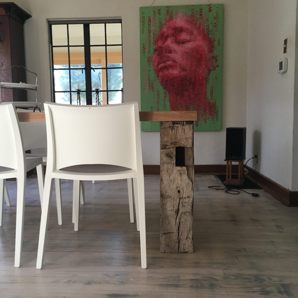
The table’s hand-hewn legs, exposed joinery, and overall lack of refinement (please note: this is emphatically not synonymous with lack of craftsmanship) express Ruskin’s virtue of savageness, a word that is etymologically related to wildness.
I’ve always found it delightful that Ruskin, a renowned art and social critic, put savageness at the top of his list of Gothic virtues, with rudeness as the corollary virtue in human character. He was, of course, using these words differently than do most of us today. By “savageness” he meant wildness, in the sense of being untamed. He criticized Victorian culture for its excessive refinement, behind which lay the ruthless exploitation of people and nature; he often referred to factory workers as people who were enslaved, forbidden the kind of life he considered worthy of the human spirit.
Edward Hopkins saw savageness in the “imperfect joints” between the boards of the table’s top. Imperfect? You bet! My client requested that I keep these boards rough sawn, neither flattening them nor straightening the edges where they would be joined together. David Bowman saw savageness in the adze marks, which are certainly the product of some hardcore hacking.
Changefulness
Oh my.
Let me count the ways in which this table resists uniformity. Most significant: My brief on this commission shoved me outside of my comfort zone. That constitutes one of the existential levels Ruskin intended by “changefulness.”
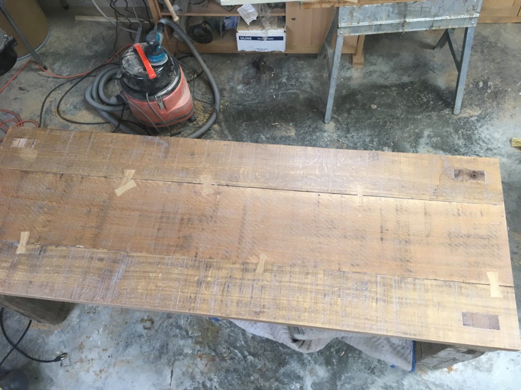
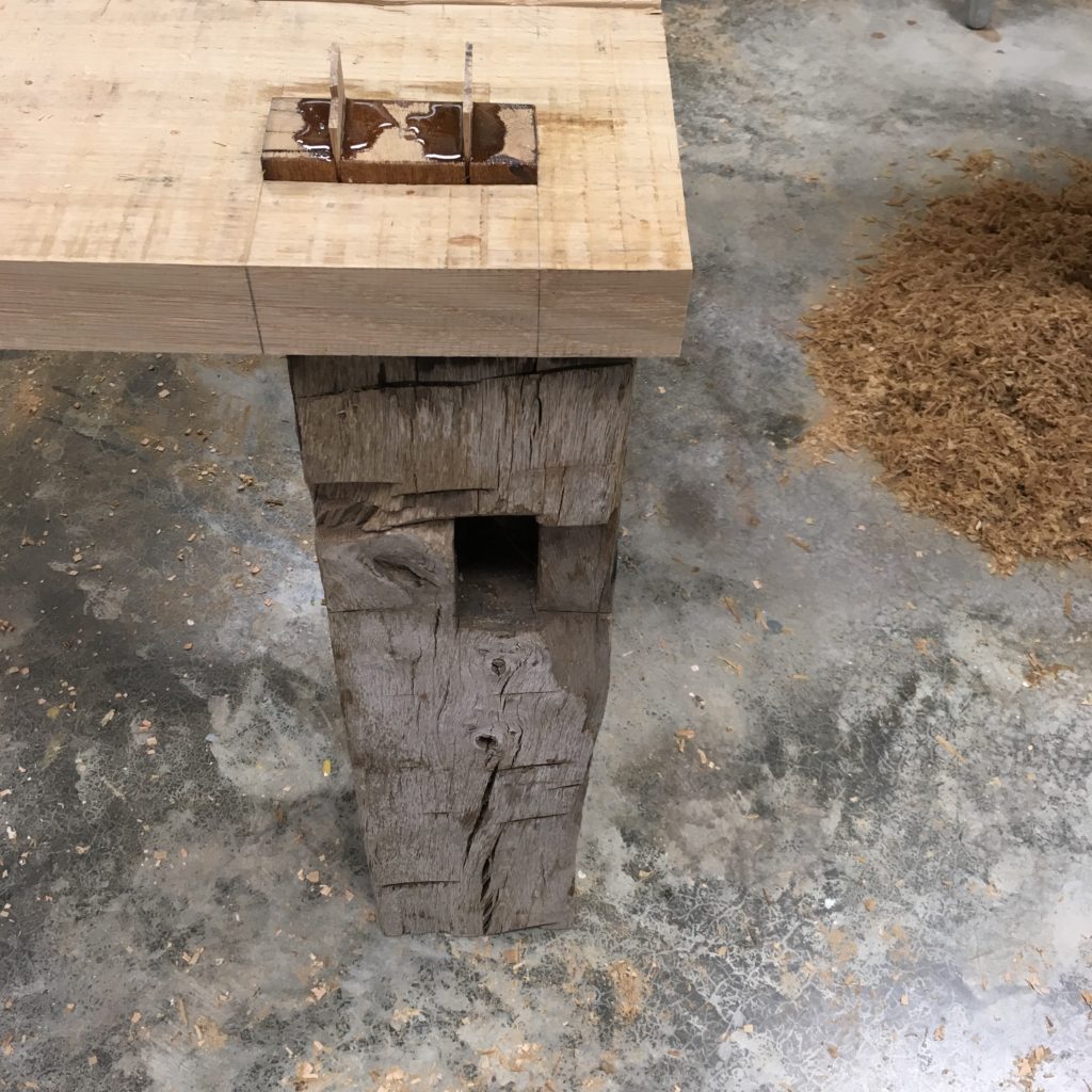
Seen from above. I took great joy in scattering the butterfly keys around on this table’s top. Each one was structural (well, all but the little dude overlaying its brother/sister near the top left; that one qualifies as “redundant”), but/and there is no prohibition, at least in this style of furniture making, against freedom from symmetry.
I love Nathan Large’s suggestion that the contrast between the joints and the material of the legs expresses changefulness. He wrote that the tenons show a “quality of craftsmanship…” that’s in contrast to “the raw legs as they [the tenons] are tamed and dimensional.”
Naturalism
Ruskin understood nature as unadulterated divine revelation – a revelation of order and power that we should not carelessly exploit for our own ends. Over and over, he railed against the humanism born of the Renaissance and Enlightenment for giving us the notion that we, as human beings, are masters of our fate.
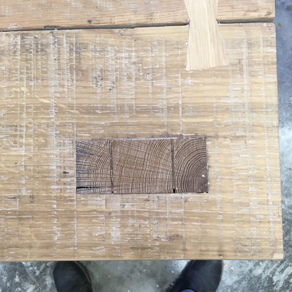
The legs of this table consist of reclaimed posts from a timberframe structure. Each is clearly a section of a log, with the pith at its center. Each was dressed by hand.
David Bowman and Edward Hopkins cited the splits and checks in the table’s legs. Steve Harrison called out the worm holes and waney edges. I love that David Bowman explicitly stated “This was a tree once.” Yes, it was a tree, and Ruskin would have us appreciate that tree in part by ensuring the future of forests – not just managed forests, which provide timber for our use, but wild forests and jungles, which he saw as essential expressions of the natural order. William Indelicato also observed that the legs “were kept as close to their true original form of trees; showing their perfect imperfections of knots, grain, and checks, allowing the individual truth of trees to be represented unconstrained with honest workmanship.”
Grotesqueness
To appreciate what Ruskin meant by the grotesque in architecture and design, I think it’s helpful to refer to the human trait he offered as a corollary: “disturbed imagination.” As in so many examples of Ruskin’s vocabulary, the disjunct between how he used this expression and what we might understand by it today prompts a guilty chuckle. That chuckle – that sense of “oh dear, I don’t know if I’m meant to laugh at that or keep a straight face” – is exactly what he was after. He wanted to dislodge his fellow Victorians from their smug, comfy self-satisfaction. He wanted them to consider where their pretty furniture came from – Who made it? What were the conditions in which they lived? — and having learned about the misery on which their comfort depended, he wanted them to work toward an economic system that would be more humane.
James Bennett comes closest in this case. “Is this object odd and un-natural in shape?” he writes. “Not to my eye. However, viewing the table from a modern aesthetic of shiny, uniform and smooth, one can [call] the table top … grotesque. The purposeful retention of milling marks, water stains, scuffs, and non-uniformity is then grotesque.” The “modern aesthetic of shiny, uniform and smooth” had its counterparts in Victorian culture, and Ruskin abhorred them for the wretchedness they concealed.
Rigidity
Ruskin explained that what he was getting at in this case was “the peculiar energy which gives … stiffness to resistance.” Roughly speaking, he contrasted the skillful engineering and craftsmanship that produced the Gothic cathedral with more basic modes of construction that used gravity in obvious ways, such as the building of the pyramids. As always, he had the builders in mind, as well as the buildings; the cathedral was a type of construction that challenged builders and required them to push the limits of their skill. The pyramids, at least according to Ruskin, had been built by slaves who were treated as little more than animals.
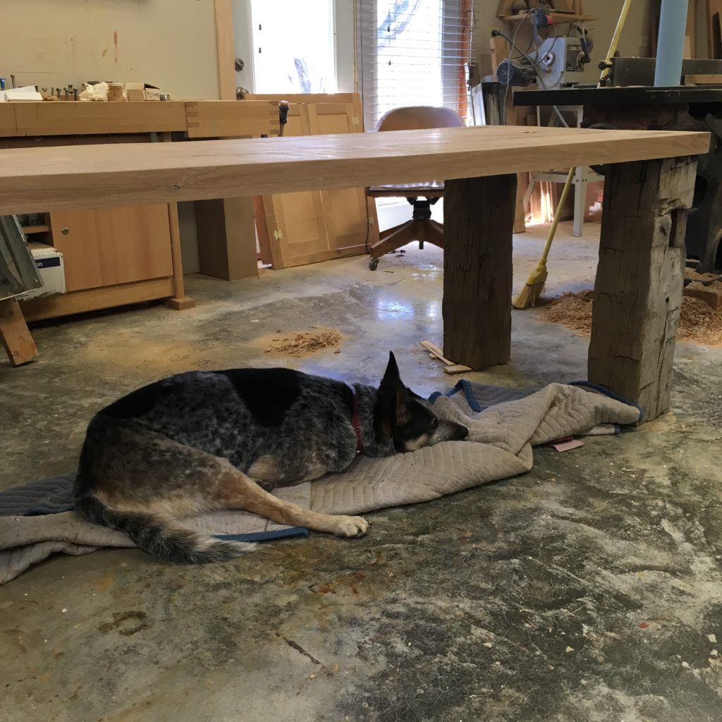
This view of the table with Joey napping beneath it expresses — albeit in a very crude form — the virtue of rigidity. The top is designed to tie the structure together without an apron, stretcher, or other support, per my client’s request.
William Indelicato wrote that the “boarded top, thick and straight, provides a strength and life… [I]t stands alone and apart.” Steve Harrison pointed out that the table used “the stubbornness of the material along with joinery to prevent racking.” Others cited the massive mortise and tenon joints, along with the wedges, which, as Greg Hamilton said, “aren’t going anywhere!”
Redundance
Ruskin used the word “redundance” in a way that’s unusual for our time, and especially dear to me. He spent much of this essay about Gothic virtues recommending self-sacrifice and a kind of austerity; against the prevailing gaudiness of Victorian style, he argued for simplicity in design. But he was aware that some people are incapable of seeing the loveliness of a building or object that is too pared down; he warned that if austerity were taken too far, it would become exclusive – a zone, so to speak, only accessible to those in the know. This would simply reinforce the kind of hierarchy that already existed in the art world, instead of enriching the lives of all. To prevent this, he urged that buildings and other artifacts should incorporate some decorative elements – nothing excessive, but just enough to make an object appeal to a broader demographic.
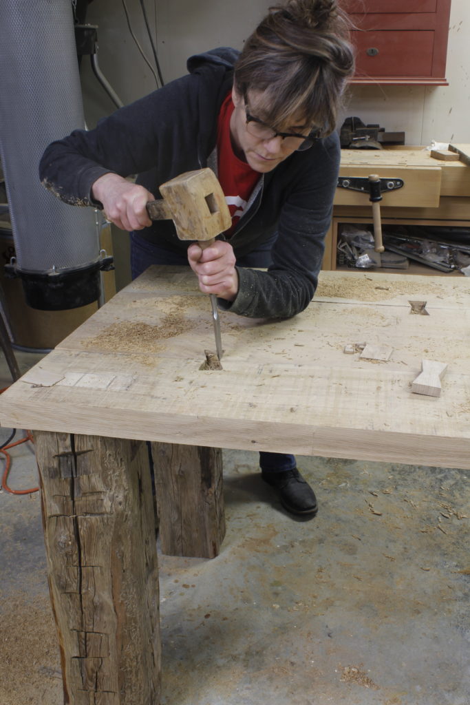
The butterfly keys in this tabletop reinforce the Domino joints that hold the three boards together while providing the kind of simple decorative element that Ruskin understood was necessary for design to appeal to more than the tiny segment of the populace who were oh-so sophisticated that they eschewed all decorative detail.
Edward Hopkins saw this Ruskinian redundance in the decoratively double-wedged tenons and butterflies. Greg Hamilton mentioned “the repetitive strengthening of what [he could] only assume are bomb proof joints” with butterfly keys and “monster wedged tenons.” Steve Harrison, too, cited the butterflies “in addition to Dominos.”
Building this table was just the kind of “ennobling labor” that Ruskin urged for all: work that stretches us and results in things that promise to stretch others. Thanks again to all of those who wrestled with these ideas.
– Nancy Hiller
Here are some supplies and tools we find essential in our everyday work around the shop. We may receive a commission from sales referred by our links; however, we have carefully selected these products for their usefulness and quality.


