We may receive a commission when you use our affiliate links. However, this does not impact our recommendations.
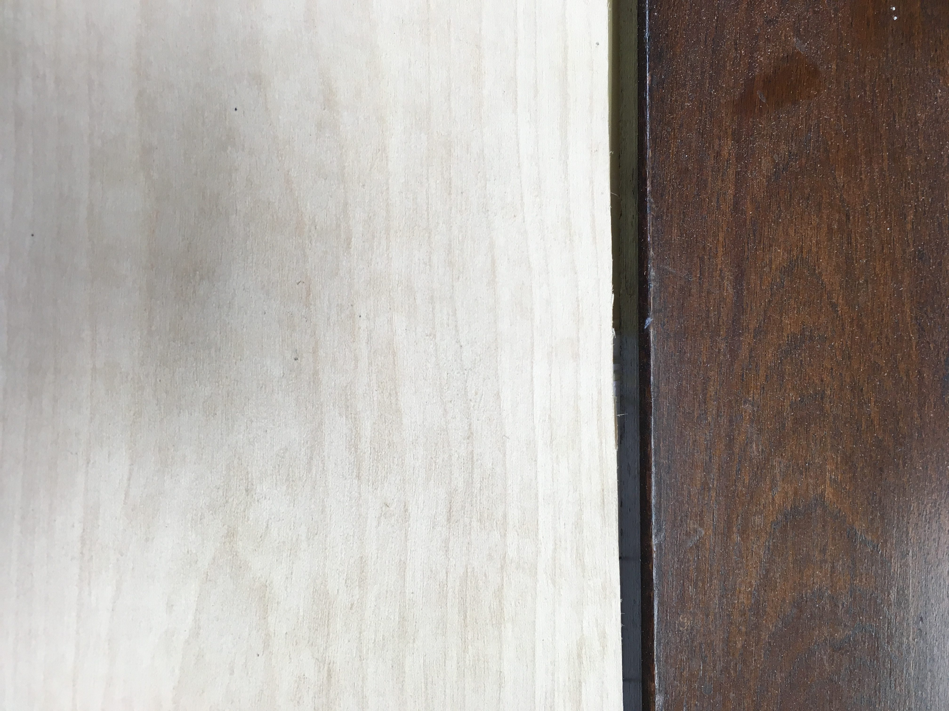
Your assignment: Make the wood on the left look like that on the right.
My current kitchen job involves a bit of mission creep. Not that that’s unusual; I often end up saying yes to ancillary work.
In this case, the mission creep consists of making new trim for a doorway and the new cased opening between the dining room and kitchen—jambs, casing, backband—all traceable to my conviction that I could make a wood section of counter that would match the house’s original trim.
The original trim is stained a dark brown. But as with most old trim, what appears to be “dark brown” involves subtleties of grain, figure, colors, and sheen. Here’s how I came up with a recipe.
Step 1: Look at the wood
I had the basic appearance to go on, augmented by familiarity with the species typically used in our locale at the time when this house was built. I suspected red gum, but the pore structure and widespread curl (especially in the backband) are also typical of birch. Although birch isn’t commonly used for trim in our area, the house was built in the era of millwork catalogs (i.e., there was ready access to trim produced far away). It was also designed by an architect, who may have spec’d something out of the ordinary.
So I added one board of birch to my weekly lumber order and began experimenting.
Step 2: Pay attention to layers of color
Looking closely, I saw undertones of orange (possibly thanks to amber shellac varnish), in addition to the kind of shading typical of glazed finishes. Had the shading been limited to areas of wear, I would not have suspected glaze. But in this case, the shading occurs in all sorts of places that don’t get rubbed or touched. On closer inspection, I could see the kind of faint lines made by a glazing brush.
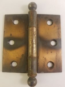
A flashed copper hinge
Why would an architect specify a glazed finish for trim, especially considering the additional expense? Perhaps he wanted the house’s woodwork to appear aged. If this strikes you as implausible in the case of a house built nearly a century ago, consider the flashed finish that was also used on hardware in the 1920s, which was clearly meant to suggest a patina from age. Home design looks back as often as it looks forward. “Today,” regardless of the year, is always on the front lines of history, a position that’s not universally experienced as promising, but is for some an existentially fraught place to be. Retro trends have always been prompted at least partly by nostalgia for the comforting solidity of the past.
I started with samples using Transtint dye in Honey Amber and Reddish Brown, followed by a series of oil-based wiping stains. Nothing seemed quite right. The undertones seemed too yellow or too red. So I made a 50:50 mix of the two dyes and added oil-based wiping stains until I hit on something at least close to the look of the color below the dark brown glaze.
I followed the dye mix with an application of Minwax oil-based wiping stain in Early American. When it was dry, I sealed it with a thin coat of Zinsser Bull’s Eye amber shellac. (For more information about the process, read my article about a similar finish.)
Step 3: Take a cold, hard look at the top color
This dark brown was rich and dark-chocolaty. I had an old can of Bartley Espresso gel stain stuffed in the back of my stain cabinet; something told me it might do the trick. Once I’d chiseled through the dense skin that had formed over the minute quantity of viable gel at the bottom of the can, I applied a generous coat with a rag, then let it sit about 10 minutes. I tried using my glazing brush to move the gel stain around, creating the appearance of wear.
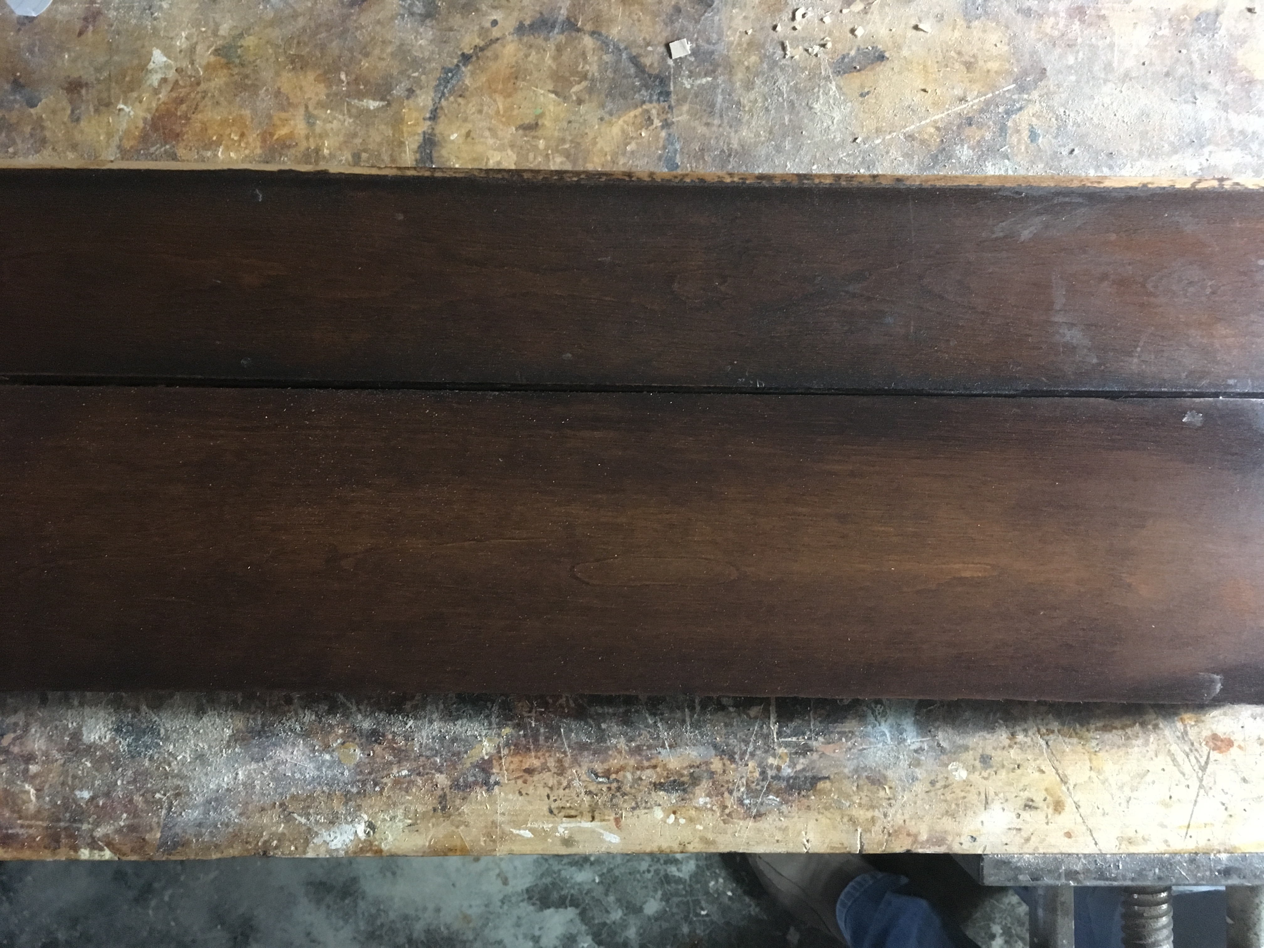
Which is which? (OK, the nail holes are a giveaway.) Granted, my sample is a little warmer in some spots, but just right in others. I also removed a bit too much of the glaze on the right side of the sample. But in real life it’s just about impossible to tell the difference between these two.
Step 4: Topcoat
I’ll finish by sealing the glaze with a coat of Zinsser Seal Coat, followed by two coats of satin oil-based poly. For all the haters of polyurethane, let me add that when you apply it in thin coats with a high-quality bristle brush, it does *not* look like “plastic.”
Note: My preference would be for the ultra-low sheen of Osmo Polyx oil, which would look very much like the sheen of the original woodwork, but according to my Osmo rep, it is not formulated for application over previously sealed surfaces. In my experience, applying it over a glaze such as this one, as I did on a prototype piece made earlier this year, leaves the finish feeling sticky. I experimented with two shades of Osmo stains in an effort to use 100% Osmo system, as my rep recommended, but I could not get anywhere close to the look I need.
Popularwoodworking.com is a participant in the Amazon Services LLC Associates Program, an affiliate advertising program designed to provide a means for sites to earn advertising fees by advertising and linking to Amazon.com and affiliated websites.
Here are some supplies and tools we find essential in our everyday work around the shop. We may receive a commission from sales referred by our links; however, we have carefully selected these products for their usefulness and quality.