We may receive a commission when you use our affiliate links. However, this does not impact our recommendations.
Continuing last week’s post (read it here) on comparative design, I thought it might be fun to move to Chippendale style chairs. The great thing about American Chippendale chairs is there’s tremendous variety, yet few are direct translations of Chippendale’s designs.
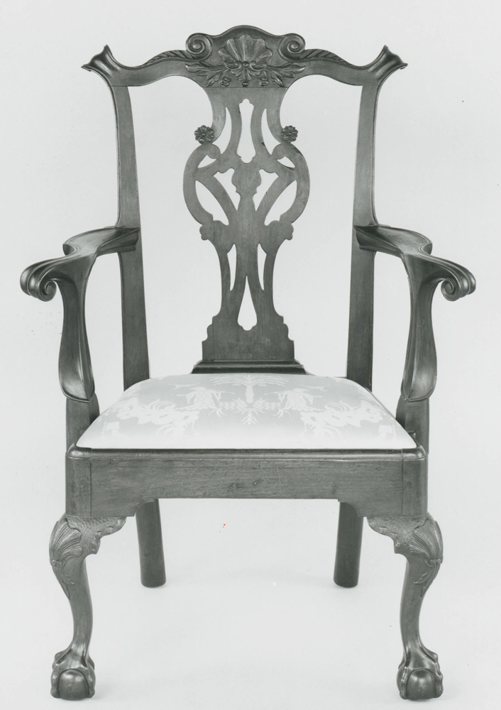
The chair to the left is a perfect example. Chippendale’s “The Gentleman’s and Cabinetmaker’s Director” features no ball and claw feet in the book, but they remained popular in the colonies through the Revolution.
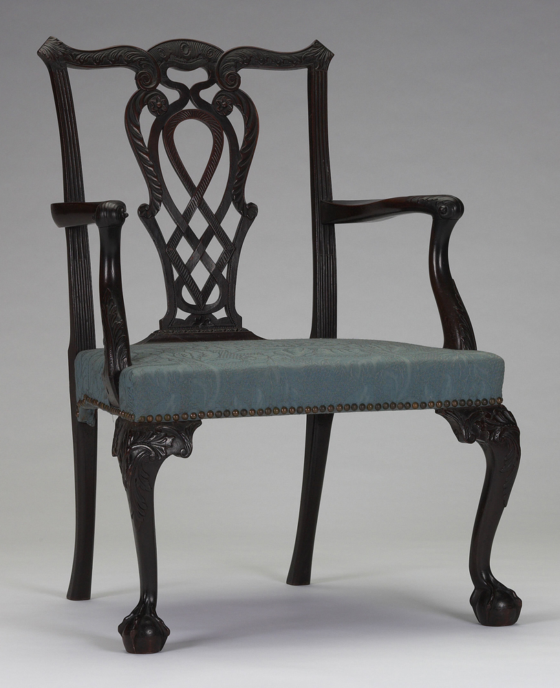
For this post, I’ve chosen chairs that have several elements in common: trapezoidal seats; eared crest rails (except one); and cabriole legs. And, yes, they all meet the criterion to be Chippendale in style. Just the fact that they have trapezoidal seats is enough to qualify. While the chairs might be from different regions, and have different feet and other details, they can all be compared using some of the ideas from the post on sack-back Windsors.
Negative spaces are very important to a successful design. This is particularly significant when looking at cabriole legs and back assemblies. When comparing cabriole legs, for example, I like to look at more than just the shape of the knee, calf and ankle. If the leg flows correctly, the negative space on the inside and outside of the leg will have graceful, flowing lines. Try focusing on the white space that surrounds the legs in the photos and you’ll see some of the legs take on a whole new appearance – some better and others worse.
Personally, I think the shapes created in the negative space are a major reason for the existence of knee blocks. Whether a peaked cyma curve or voluted, they add interest to every aspect of a cabriole leg. They punctuate the interior of the leg and give the knee more definition; they provide balance for the foot while calling attention to slender ankles.
Chair backs are where negative spaces run rampant. On chairs with pierced splats the spaces can often be overwhelming, but solid splatted chairs can sometimes appear dull and stunted. When you see a chair where the negative space between the leg and splat just flows, however, often reduces the pierced or solid splat to little more than a border.
These negative spaces help define the chair. Often they make the difference between a chair that borders on appearing too wide and one that is plainly elegant. They can take a chair with a back that’s just too tall and give it needed breadth, or one that’s too wide some height.
Look through the chairs in this post and comment on what you see. It’s fine to compare one chair to another (in fact, I’ll be disappointed if you don’t). Which chairs appear the most, and least, in proportion? Which have combined various elements to achieve a taller or more balanced appearance? Which have legs that are too thick, too thin or are just right?
Like most woodworkers, I like to think I’m pretty optimistic. When it comes to furniture design, however, sometimes being negative is a good thing.
For more on cabriole legs, check out this digital download from Glen D. Huey.
Here are some supplies and tools we find essential in our everyday work around the shop. We may receive a commission from sales referred by our links; however, we have carefully selected these products for their usefulness and quality.


Were the back designs a signature of the maker? ( I’m thinking about guitar headstock designs which are usually unique to each luthier.)
Hi Chuck
These posts have been great. I guess I’ve just never seen so many comparative pics before, but you can certainly see in the pics what you are talking about in the differences. I have to say even on the “flawed” chairs they are all wonderful. What I am often thinking on the not so high but wider chairs, versus the more elegant and graceful chairs, is it possible some are Masculine, and some Feminine? On the back splats I like the solid ones, while my Wife loves the open ones, which to my eye look too frilly, again Masculine/Feminine. It just made me wonder.
I also wondered if maybe it was just what the maker could remember after seeing a chair he liked. Would it have all been changed if they had digital cameras, and computers so they could also look at several chairs at once, rather than going from memory, a sketch, or some jotted down dimensions?
Time travel would be awesome, to go back and say, Hey Isahia, what were ya thinking here?
There is so much going on with these chairs, having negative space is a welcome relief for your eye.
How much negative space do you need in a design? We have decided, as consumers and makers, that chairs need to be light visually. Examples include a number 14 Thonet chair or a Sam Maloof low back side chair. Aside from carved back wainscot chairs it is difficult to find examples of chairs not having a significant proportion of their design given over to negative space.
In the examples above all but one have complete negative space below the seat – only the chair from the Metropolitan Museum has stretchers which give it a more utilitarian, less elegant appearance. This is probably a structural requirement because it is the only example that is a side chair rather than a host’s chair, but it still moves the chair towards the utilitarian end of the spectrum. Of the others, the examples with the pierced back splats work better with regards to design. The negative space created by the piercing lightens the overall look and allows it to fit and flow with the negative space below the seat.
I wonder if chairs are unique in their requirements for lightness (having significant negative spaces)? Many chests, bookcases and other case pieces have almost no negative space. Excepting, of course, Rhode Island style high chests, and the chest on stand as popularized by makers like James Krenov. Maybe chairs are not unique – tables of all kinds have lots of negative space both below and above the flat, horizontal surface.
The collective design experience of the society in which a piece is produced informs that piece’s design. Is the amount of negative space in a piece a reaction to conform with that assertion or a rebellion against it?
Really beautiful chairs and they make me want to go learn some more.
Now I’m going to be looking at chairs in a different way….thxs!