We may receive a commission when you use our affiliate links. However, this does not impact our recommendations.
Typically when I delve into historic research, it has something to do with 16th- and early 17th-century playwrights and playhouses, social mobility and the burgeoning middle class… stuff that has little to do with woodworking (although there is a carpentry scene I quite like in Marlowe’s “The Jew of Malta”; craftsmen are engaged to build a false floor above a pit that holds a boiling cauldron. Suffice it to say it does not end well for the fellow who falls therein).
But today, I was looking at the far more recent past: the beginning of our presence on the interwebs. I introduced a co-worker to web.archive.org – also known as the Wayback Machine, then promptly fell down the rabbit hole.
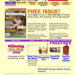
It appears that PopWood.com was launched in 1998 (and I believe it may have been the first web site for F&W Publications, as we were known at the time). And it looked like this (by the way – all the images can be made larger by clicking on them):
 That was actually the year I started with the company, but at the time, I was in our Creative Services department where I wrote ads and tried to come up with winning direct marketing campaigns and continuity series.
I don’t know what life was like down in the basement (where the PopWood staff was quartered), but in my department, we shared a computer and I’m not even sure we could connect to the world wide web. All my work was saved on those big floppy disks (5″? 6″? I can’t remember). And we still used Chartpak Graphic Tape for many layout tasks. (I miss that tape. I also miss the smell of the waxer we used to stick pieces of paper onto layout boards.)
 So while this page may not look like much to my now-jaded and over-computered eyes, it was truly revolutionary for 1998 and for F&W Publications. And it certainly is eye catching. And colorful.
Fast forward one year, and we had a new and cleaner look (at right), with the typical-for-the-time right and left navigation bars, and editorial down the center. And we must have liked that look; we stuck with it until mid-2003.
 Then a few tweaks removed the right nav to free up a more inviting editorial well for plans, free articles, tool reviews and the like. But that red and gray color scheme is still in full force. Hmmm…I seem to recall that the managing editor at the time was an Ohio State grad school alum (not to mention a trained journalist). That look was still in place when I joined the staff in mid-2005. And while I have no recollection of the front-end look, I well recall the draconian site management. (I shouldn’t complain; that’s how I learned html code.)
 And sometime in 2008, we moved to the penultimate look, and our readers may recall (we switched from it to the current one in early 2011). I kinda liked this look. The earthy colors are inviting. It was easier to follow and – assuming we left the same topics in the same place all the time – was pretty easy to follow. But it allowed precious little room for creativity. And all those boxes at times seemed a little stifling. Oh, the backend CMS was a headache of massive, twisty, convoluted, illogical proportions. But we made it work. And my coding got better.
And of course, you know what our current site looks like – you’re looking at it now. And boy howdy is the CMS a lot easier!
So why’d I jump into this hole? We’re about to celebrate our 200th issue, so we’ve been looking back at what got us to where we are today. And you’ll be reading more about that in the coming months, culminating with a special issue. And that’s all I’m gonna say about that. Otherwise my boss may reenact that “Jew of Malta” scene referenced above.
Oh and a wee contest – with no prize other than bragging rights – because it’s too easy. Our first-ever blog entry was by Christopher Schwarz in 2005. Want to guess what it’s about? (It’s still available on our site – but don’t peek before guessing!)
Here are some supplies and tools we find essential in our everyday work around the shop. We may receive a commission from sales referred by our links; however, we have carefully selected these products for their usefulness and quality.


Workbenches?
Perhaps they were 5-1/4″ with a maximum storage of about 1.2MB for DSHD.