We may receive a commission when you use our affiliate links. However, this does not impact our recommendations.
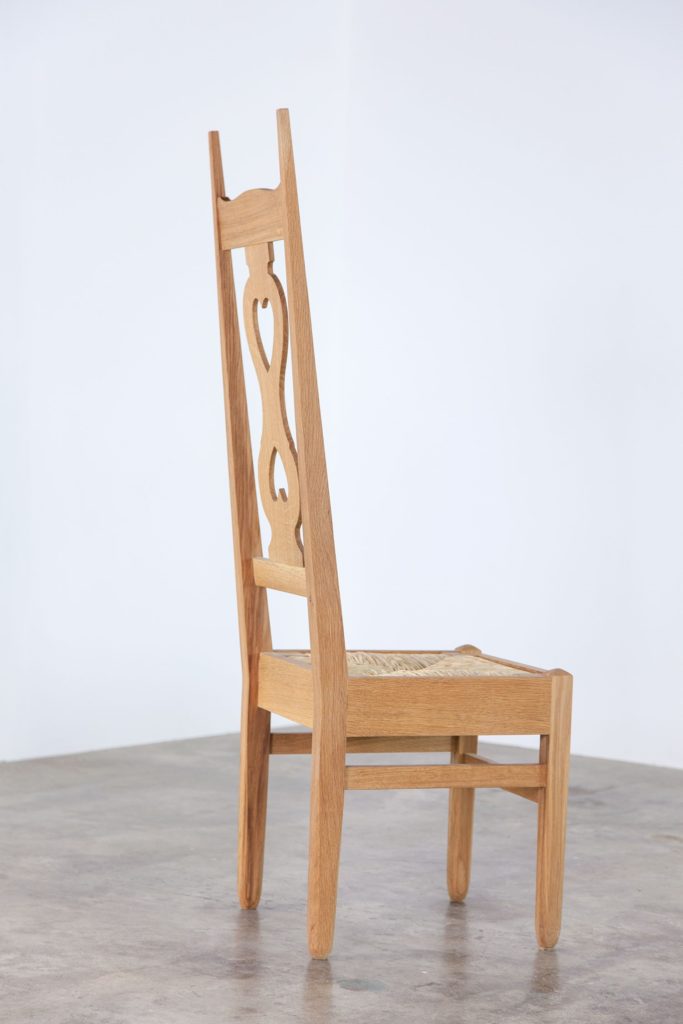
My measured reproduction of Voysey’s 1898 design, the first project in Popular Woodworking’s forthcoming book on English Arts and Crafts furniture. (Photo: Siosi Design) Seat weaving by Cathryn Peters.
A recent post about my visit to The Wilson (formerly known as the Cheltenham Museum) last winter sparked special interest in a chair designed by architect Charles Frances Annesley Voysey in 1898 – the chair that was the primary reason for my trip to England. It seems a few people are champing at the bit for a deeper peek into the contents of Popular Woodworking’s forthcoming book on English Arts and Crafts furniture, which is scheduled for publication in May 2018. Luckily editors Megan Fitzpatrick and Scott Francis gave me the green light to publish the occasional post related to the book over the coming months.
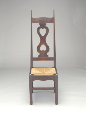
An original example of the chair design, this one in the collection of Crab Tree Farm, north of Chicago
I’m not ordinarily a fan of furniture with heart cut-outs, but when I spotted this chair in an online search I was smitten. There’s nothing sweet about this pair of hearts, thanks to those finials, which look sharp enough to take out an eye. During my research on the chair, I came across some interesting variations on the theme. Enjoy this pot pourri of details.
+++
1. Shady business
Part of what makes this chair so striking is its dark color. But that striking red-brown is a flagrant violation of the designer’s original intent. (Oops.)
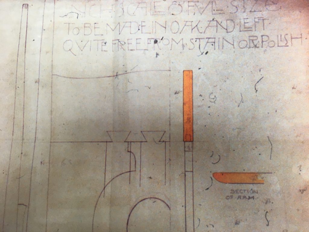
The second and third lines read: “To be made in oak and left quite free from stain or polish.” This illustration is a snapshot of a printout from an original microfilm copy of the original drawing kindly provided to me by David Berman of Trustworth Studios.
The chair was originally intended to be blonde, with no more than a light coat of linseed oil. Black and white photographs from the turn of the century show examples of this chair and other furnishings designed by Voysey almost ghostly in their pallor. But that didn’t stop clients from specifying the look they preferred, or subsequent owners from slathering their Voysey pieces with the forbidden stain and polish.
2. Eye protection required
However perilously pointy I found the finials on the chair I measured, they seem downright dull in contrast with the devilish spikes of Voysey’s original design, as seen in his thumbnail sketch of the chair in front and side elevations, below. The back legs taper to 9/16″ square on the chair I measured, but the drawing has them ending at a stiletto-sharp 5/16″.
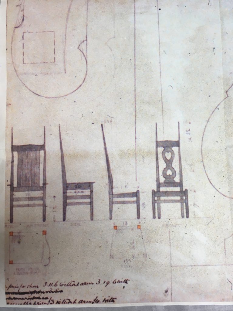
Detail from the same printout of Voysey’s original drawing, courtesy of David Berman
The two heart chair in this original drawing also differs from those at The Wilson and Crab Tree Farms in that its seat tapers outward from back to front, and it angles downward toward the back, as is common for chairs.
3. Variation on the theme
David Berman has an original Voysey chair, this one a single heart design with arms. It was fascinating to compare the shaping of the front and back legs to that of the chair I had measured. This chair has the same basic treatment, but its legs are more finely proportioned.
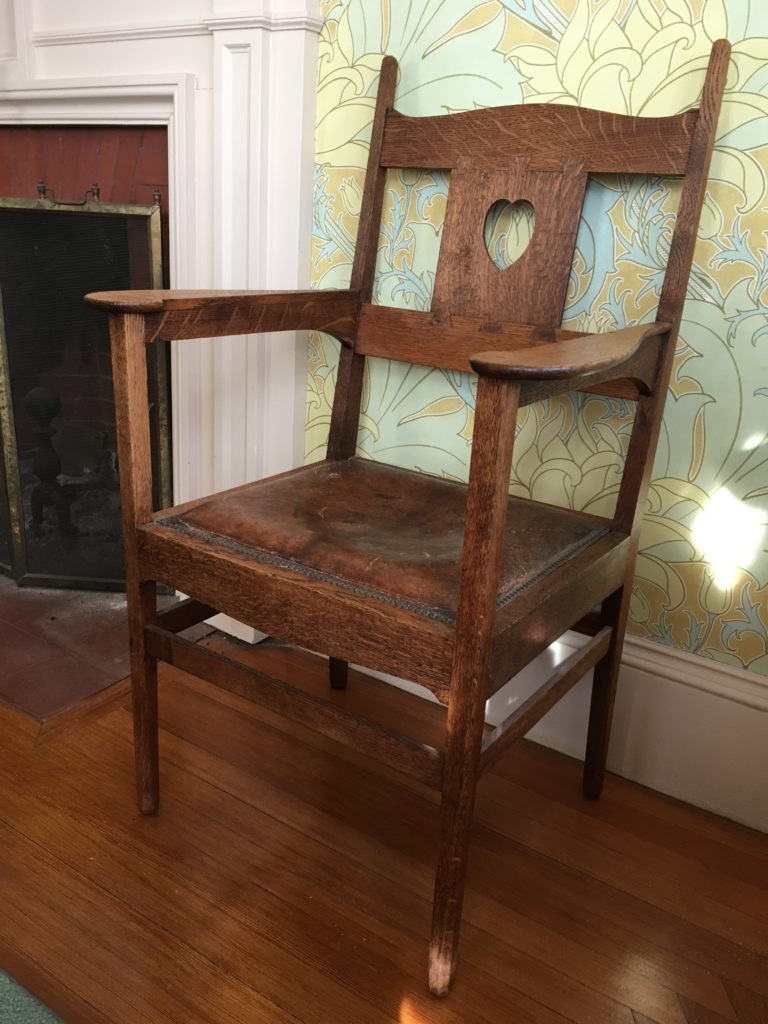
David Berman’s original Voysey chair, a somewhat different take on the design, with wallpaper of Berman’s own making in the background
4 Split splat
The splat on David’s chair is joined to the back rails by means of dovetails.
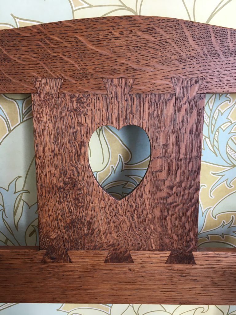
Note that the splat has split (ouch) in a few places. Even though it’s made from quartersawn lumber, it seems to have needed to move a bit over the past century. In principle, these splits could have occurred at the time of the chair’s making; they’re just the kind of splits that are my most common dovetail fail, the result of getting the fit too tight. But based on everything I’ve read about the craftsmen [sic.] who executed Voysey’s designs, I doubt that such faux pas would have made it into the finished piece.
5. David’s chair is groovy
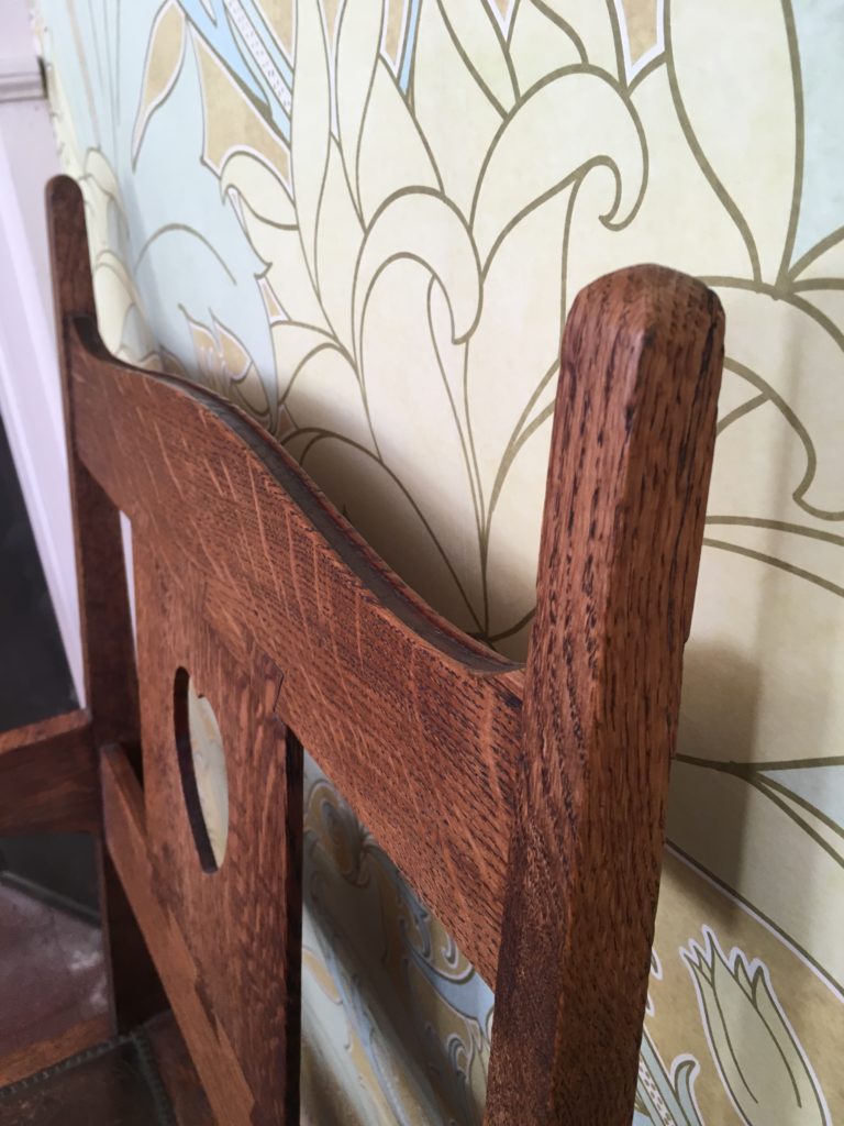
Some of Voysey’s chairs have this subtle groove along the crest rail, though the one I measured does not.
6. Call to arms
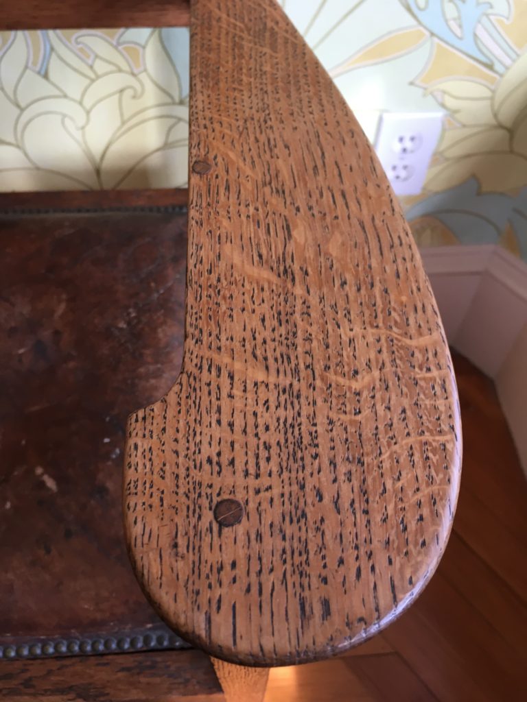
The arms on David’s chair are similar to those indicated in Voysey’s original drawing for the slatted version of his tall back chair and are joined to the rail below them with pegs. Note the delicacy of this arm, and of the chair in general, compared to many examples of American Arts and Crafts furniture.
Here are some supplies and tools we find essential in our everyday work around the shop. We may receive a commission from sales referred by our links; however, we have carefully selected these products for their usefulness and quality.



Gutsy placement of that second dowel on the arm, pinning it down to the support.
I’m convinced that many “modern” designers had it in for people. Here’s an example of chair plans suitable for impaling Vlad’s great-great…-grandchildren. Yikes, spikes!
That groove is really sweet!