We may receive a commission when you use our affiliate links. However, this does not impact our recommendations.

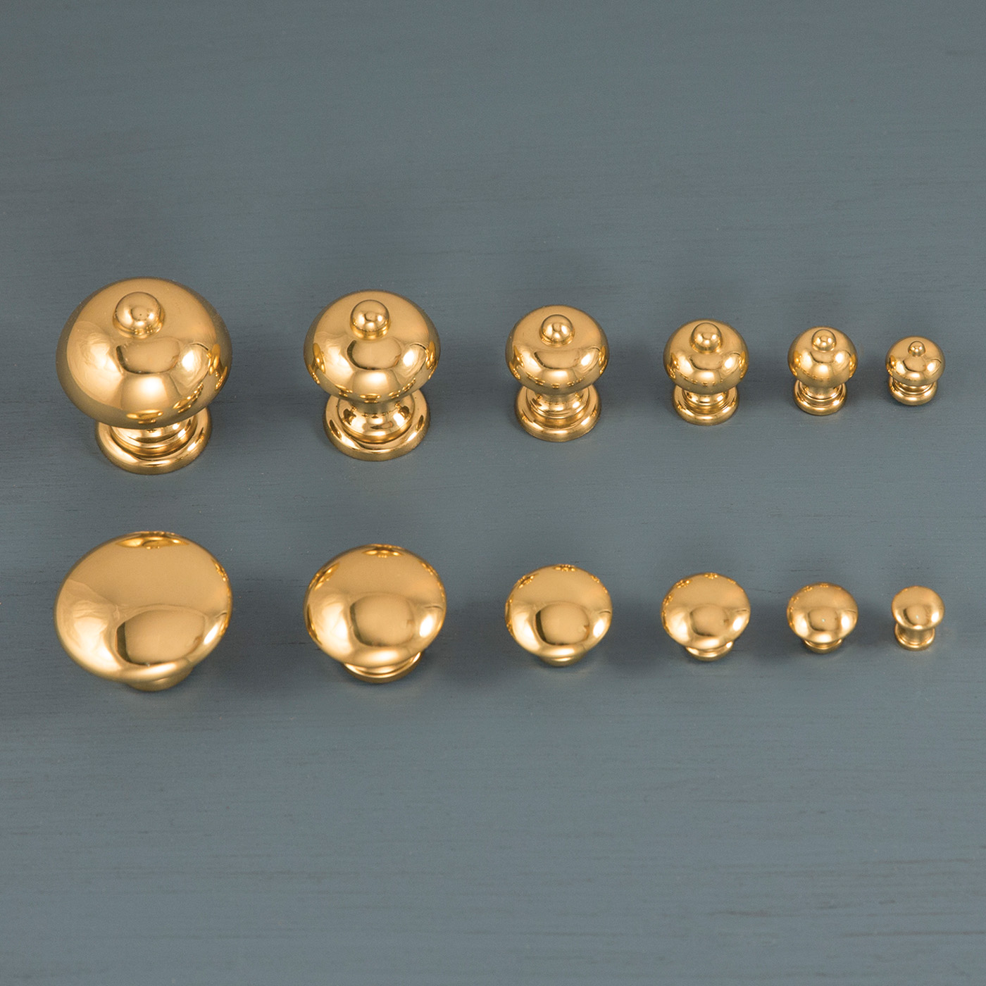
Details. Even something as small as the right-sized brass knobs can make a drawer design go from better to best. (The knobs pictured above are from Whitechapel.)
Good, better or best? Small details and design decisions make a difference.
It’s every manufacturer’s dream to have “one size fit all.” Yet imagine a trip to the shoe store and upon arriving, you discover they offer only one size. We understand clearly that function is tied directly to size; a poor- fitting shoe is painful. Yet less obvious is how the “right fit” to our eye can affect aesthetics. We respond viscerally to something far off-kilter, but struggle with those small judgments that can make the difference between the good, the better and the best. That’s at the heart of making design decisions. We search for that feeling of “rightness” for our own sake, and always in the back of our mind is the awareness that others will respond to it.
Cutting Through the Maze

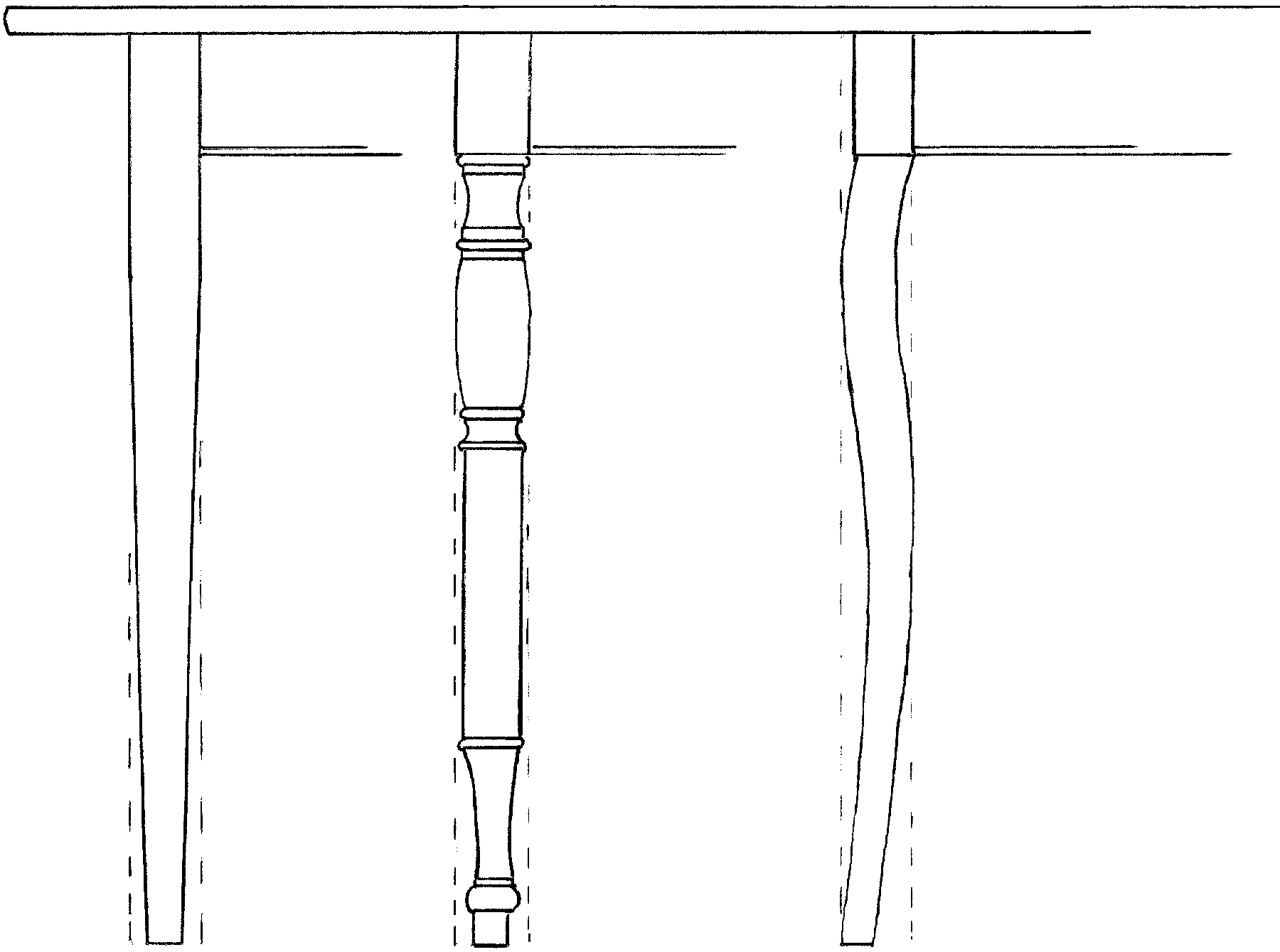
Proportions. Though different, each of these leg forms occupies the same proportional envelope. All must relate to the neighboring parts and to the whole.
That’s where the rub comes in; trusting your inner eye and making design decisions seems like a big leap into the unknown. How do we learn to use our eye to guide the dozens of design choices required to make even a simple table? What shape do I make the top? Should I stain the wood and should the finish be glossy or satin? Obviously, each of these questions leads to a dozen more, and many must be weighed against function, cost and one’s own skill.
Yet the design choices driven by function or need are not usually what we get hung up on. Roughing in those functional details, like making a table a comfortable height or adding a small drawer for your spouse’s garden journal, is straightforward. The slippery questions arise as we search for that sense of rightness to our eye.
Simplify the Process
It would be great to make solid judgments naturally, but for most of us (myself included), it involves learning how to tap into an inherent sense of proportion and getting past all the clutter blocking the view. I use a thought process I call “good, better, best” (GBB) to help me get past the clutter.
In short, it’s about breaking down a design into parts and gauging each element as it relates to parts closest to it, to the piece as a whole and to how it relates in its own internal details. GBB helps to quickly find a good solution and through refinements make it better, and then best.
Let’s design a leg for a table as an example. Now our leg could be turned, rectilinear, a sculptural form or a combination of all of these. Any one of a thousand options could sing beautifully with that feeling of rightness – or strike a tone that misses the mark and falls flat. Regardless of the form, GBB involves testing how it relates to other parts of the design.
Application

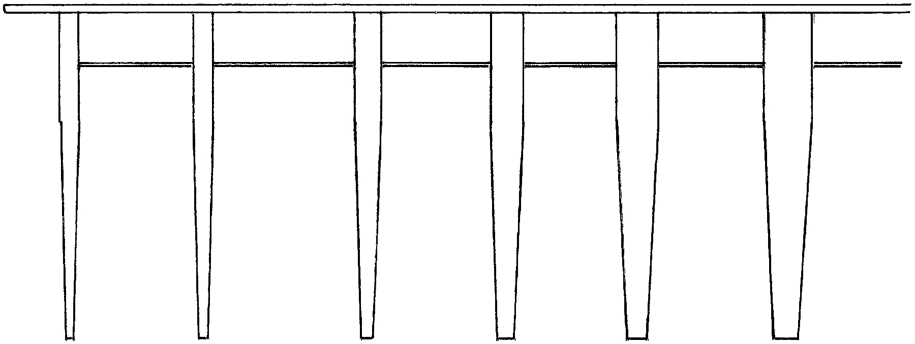
Relations. By focusing on the relationship between leg and apron, we can zero in on a sweet spot. Which leg thickness looks best to your eye?
Begin by comparing a range of different leg thicknesses and how the leg relates visually to the part closest to it, in this case the table apron. Rather than start with an arbitrary numerical dimension, begin with a proportion plucked from the design itself. You might take the leg thickness from the height of the apron; half the apron height is a good jumping-off place. I find it helpful to keep my eye tuned to proportional relationships.
Work up a sketch from that starting point then make a second sketch bumping the leg thickness a tad heavier. You might increase it by a fifth or a sixth of its thickness. Pause and consider how it relates to the apron. Does it look too heavy? Work up a sketch decreasing the leg. You may end up with five or six (or 20) versions.
As you begin to zero in on the thickness that relates to the apron, pause and compare the leg to the entire table. Letting your eye switch between the overall view and smaller view will help you discern if it needs further adjustment. Your eye will naturally be drawn to the good, the better, then the best.
If you doubt your judgment, ask yourself at what point does the leg look obviously too thick or thin? Isolating elements using GBB forces your eye to make judgments between just two or three elements at one time rather than take random stabs in the dark. A design may progress from a scale drawing to a full-sized mockup before actual construction begins. The GBB logic applies to a mock-up just the same as to a drawing. By disciplining yourself to walk through this approach, you will find your eye quickly responding to more subtle adjustments.
Macro to Micro

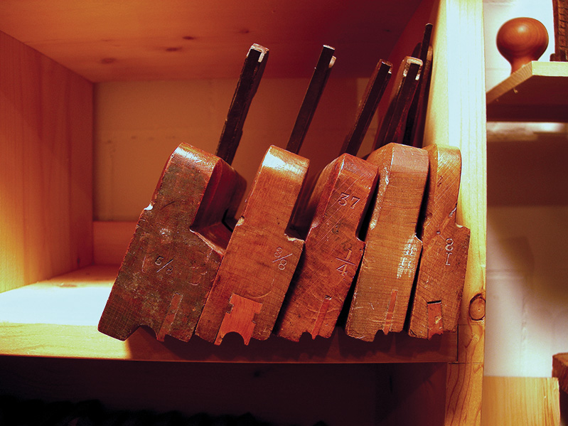
Choices. Beading planes come in different sizes so that an artisan can choose the “best” detail for a particular design.
Apply the same logic to small details internal to an element. For example, drawer pulls are compared visually against the height of the drawer face. Every chamfer, bead, inlay and hardware detail can be sifted by your eye – thus the reason better hardware suppliers offer pulls and knobs in a wide array of sizes. The same logic drove wooden planemakers to offer dedicated moulding profiles in small increments. Every detail can be isolated by your eye, and narrowed down to GBB.
As your eye and confidence improve you may find yourself comparing in smaller increments, sorting through 20 curves to zero in on the best. This just means your eye is responding with a finer degree of discretion. Trust your eye; it won’t lead you astray.
Here are some supplies and tools we find essential in our everyday work around the shop. We may receive a commission from sales referred by our links; however, we have carefully selected these products for their usefulness and quality.


