We may receive a commission when you use our affiliate links. However, this does not impact our recommendations.

Start small. Learning how to make small adjustments to a design can actually help train your “designer’s eye.”
Small changes can make a big design difference – and help train your eye.
How do you dial in the proportions on a furniture design? I used to pose that question a lot. Perhaps what makes this puzzling is the fact that small differences can have a dramatic effect. The line between the merely good and the dazzling is often blurry. Face it: Most of us aren’t setting out to create a masterpiece; we’d just like to be able to make solid, confident design decisions and create furniture we’re proud of.
For many years, whenever I’d spot an eye-catching bookcase or chair design, I’d question the maker about how he or she found that sweet spot. But even experienced builders often have difficulty answering that question. I often heard, “trust your gut.” That’s code for, “Build a lot of furniture and eventually your eye for proportions becomes second nature.”

Quite a difference. Just pull one or two facial proportions out of what’s considered average, and the effect is glaring.
No doubt – there’s no substitute for experience. But for many of us it sounds like a long journey. Even if you accept a long journey as part of the equation, a road map would be nice. I don’t want to set out on a journey to Savannah, Ga., and end up in Newark, N.J. (no offense to the Garden State). The good news is that our woodworking tradition offers some helpful insight to help us cut through the fog. With a little practice you can begin to trust your gut and not have to wait until you’ve designed and built a lifetime’s worth of furniture.
Tapping Into Your Sixth Sense
Regardless of any self-doubt you may harbor, you already have a strong sense of proportion. Leonardo da Vinci illustrated this vividly with a series of drawings called grotesques. He took a normal human face and exaggerated just one or two proportions out of kilter. Our natural reaction to those images is a testimony to our inherent sensitivity to proportions. The key, then, is learning how to tap into this proportional sixth sense, and learn to consciously unpack a design to begin to see proportional relationships.
But before we tackle the subject of dialing in proportions on a furniture design, it’s important to acknowledge that our individual sense of proportions is subjective. There are broad principles of design that most of us find compelling, but individuals have a range they find pleasing. It’s similar to our preferences in music. We may enjoy different types of music – jazz, rock, bluegrass or classical – but underneath all it’s held together with just a few simple notes. Just like we have an ear for musical notes, we can develop an eye for proportions.
A Dash of Salt

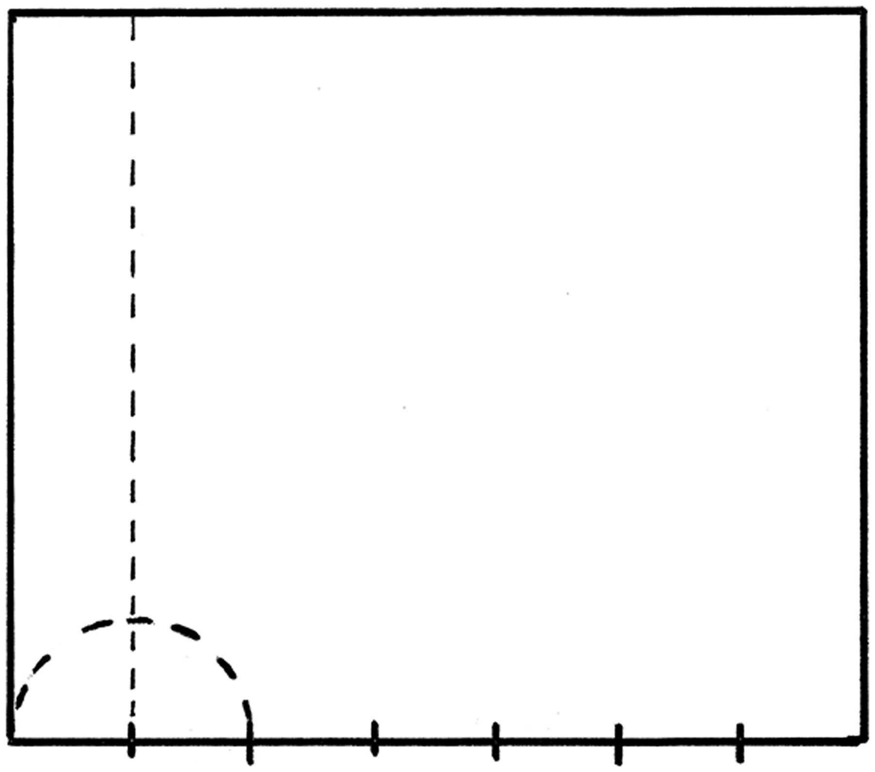
Past proportions. Frequently in historic work, a rectangle that defined a space (such as a small chest or table) was bumped by a sixth taken from the width. Here is a square that’s bumped wider. Historic design books called this “a square and a sixth.”
Historic design books from the pre-industrial era had a thing about dividing an element or space into six equal parts and using a sixth to nudge a proportion one way or another. That may sound odd but actually has some solid logic behind it. If you tweak an element by something smaller than a sixth, it’s hardly detectable to the eye. Conversely, if you adjust by a coarser proportion, it can be too large of a bump. Sort of like a bad haircut. Somehow a sixth is just like a dash of salt – enough that the eye picks up on it but not too far.
Who’s Related to Whom?
Design is largely about connections, and as a builder it’s most important to learn how to find a way to connect with your inner eye. As you work through a design or a build, you may sense something is off. It may be a just a sense that the design is too heavy, or clunky.
Often it’s a border element that looks a bit out of whack. By border, I mean any element that defines an internal space within a design. It can be a vertical border, such as the stiles that frame a raised-panel door or the legs at each corner of a table. Likewise, horizontal borders can be the rails on a door frame or the cornice at the top of a chest. If these border elements are off it’s usually quite apparent.

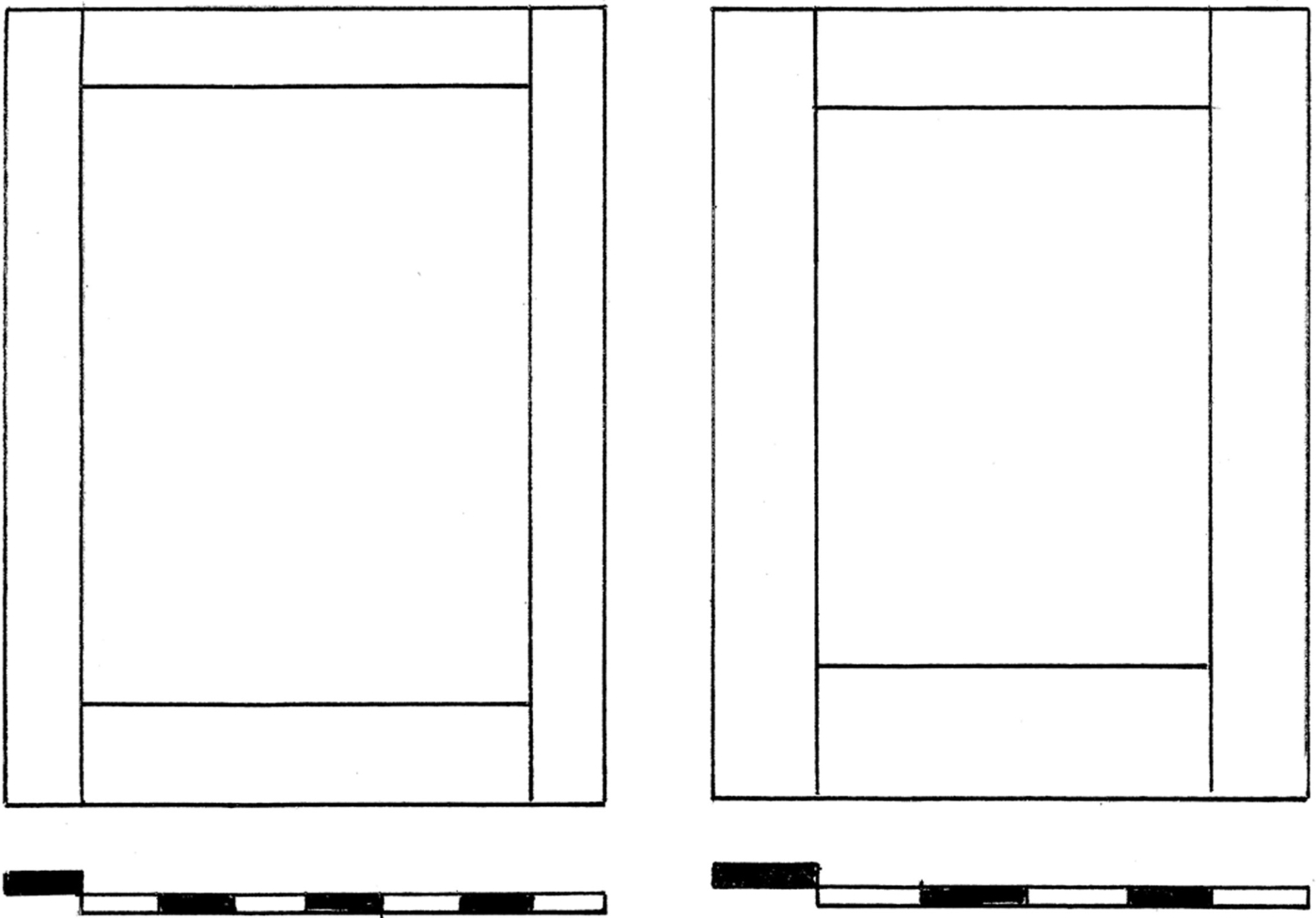
Is one better? These door stiles and rails are related proportionally to the adjoining door opening space. Does one appear more pleasing?
Let’s use an example of vertical stiles that appear too heavy flanking a door frame. Before you begin taking random stabs at it, start by picturing clearly what is related to what, proportionally.
Sometimes sorting out a design to make adjustments is like getting dragged to someone else’s big family reunion. All those confusing aunts, uncles and cousins – who’s related to whom? That stile may look a bit heavy, but in relation to what? Keep in mind that border elements always relate to the space they define.

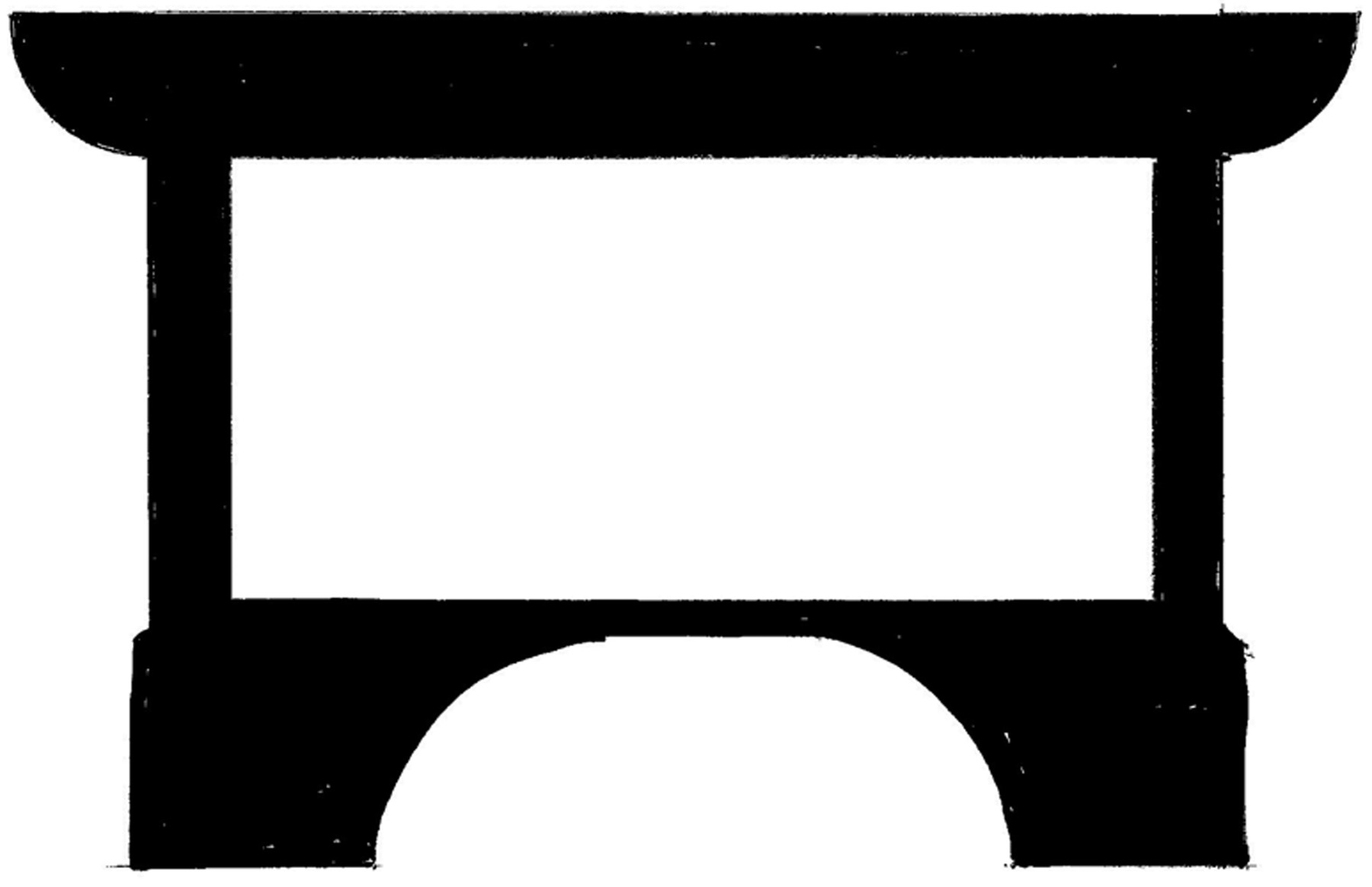
Borders. The heavy top, sides and base form the visual borders in this composition. These are exaggerated to show the effect that borders can have on a design.
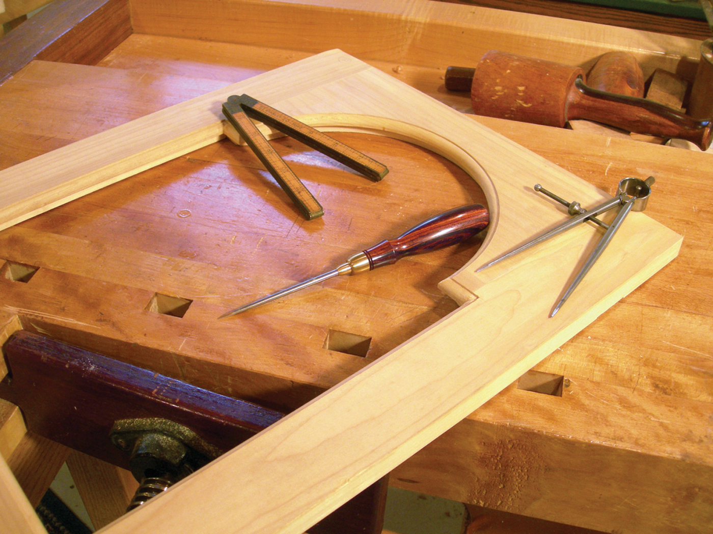
A vertical border such as a door stile relates to the width of door space it frames. Just making that connection alone may free you to simply eyeball it and move on. But if you want to really cement a solid proportional image in your inner eye, pull out a set of dividers and take a moment to experiment with the proportions in that space. Divide the width of that door opening into five equal spaces and use one fifth to define the stile. That may be too heavy; that’s OK. You can try dividing the space by six, seven, up to 12 equal spaces. This allows you to gradually creep up on the sweet spot for which your eye is searching. Also, by physically stepping off the space with dividers, your eye soaks in a powerful image of the proportional dynamic.
It’s not really important what proportion you settle on; the key is that you begin to make the connection between the spaces. As you continue to tweak it down in proportional increments, at some point the width of the rail will cross a line and look weak – a signal you’ve shifted past where your eye (gut) wanted to take you. This same principle applies to horizontal borders, only they relate to the height of spaces they define.
Here are some supplies and tools we find essential in our everyday work around the shop. We may receive a commission from sales referred by our links; however, we have carefully selected these products for their usefulness and quality.


