We may receive a commission when you use our affiliate links. However, this does not impact our recommendations.
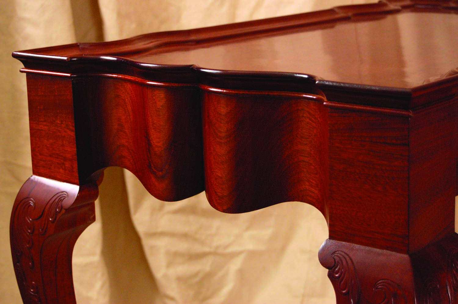
Stunning. The flowing curves of this Newport table are, quite simply, stunning.
Getting off the straight path can be liberating.
I can see it with my eyes shut: a curving stretch of highway snaking past Otter Cliffs in Acadia National Park. Each twist in the road opens up a jaw-dropping vista of surf crashing on the pink granite shoreline. You probably have a favorite stretch of road. Chances are good that highway has some curves that gently unveil a landscape dear to your memory.
For as long as woodworkers have been turning logs into boards, we’ve been making furniture with straight lines. Like our superhighway system, straight lines are functional, efficient and … predictable. No surprise, then, that we are tempted to experiment with curves. A simple flowing line or a combination of curves can add life and vibrancy to your designs.

Naturally inspired. Nature abounds with examples of curvature to fuel our imagination.
Curved surfaces have an appeal on a number of levels. First, a curved surface has a tactile attraction. In a very real sense, our hands are a second set of eyes. Without thinking, we trace our fingertips across a curved drawer front, and small elements such as a sculpted handle or pull can be almost irresistible. Curves also have a powerful visual component in that they lead the eye, especially in areas of transition.
It’s quite common in nature to see gentle curved transitions. Just look at your thumb. Does it jut out the end of your arm like a railroad spike nailed in place? Or does it flow from your hand like something that, well, grew there?

Around the next bend. Every turn on my favorite road unveils a stunning vista of sea, sky and granite.
Finally, curved surfaces add life due to their reflective properties. A flat surface reflects light in a single monotone band while curved surfaces play with light and shadow. A convex surface has an area of maximum reflection that fades gradually back into shadow. Concave surfaces are just the opposite, with maximum areas of shadow gradually giving way to greater reflection. This play of reflection and shadow can make a piece seem alive. It gives an impression of movement as you walk past and view the piece from different angles.
Go Beyond the Straight & Narrow
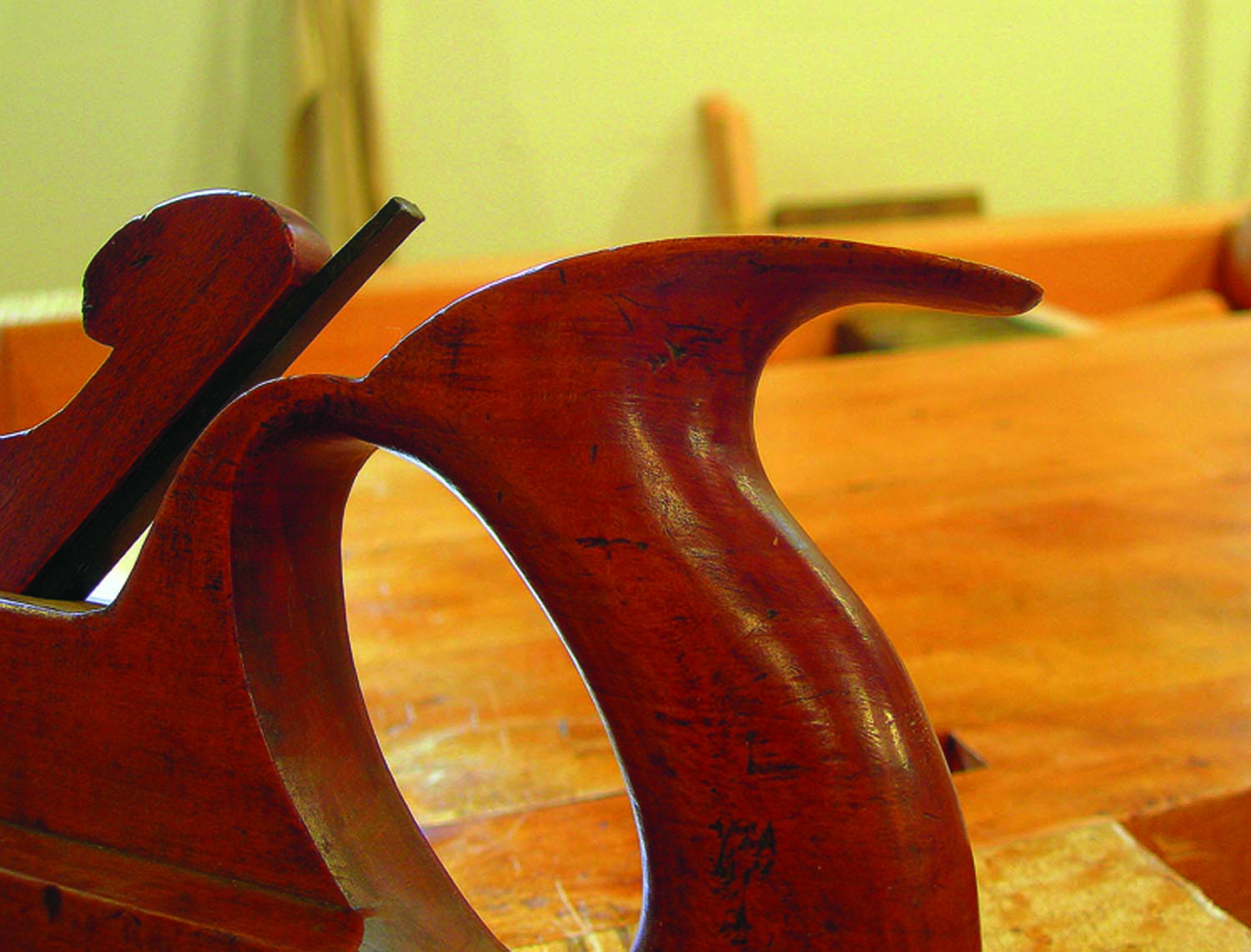
Inviting curves. The contours in this sculpted tote beg you to grab hold of it.
If the thought of introducing curves causes you to break out in a cold sweat, you’re not alone. Face it – much of our initial training in woodcraft is focused on creating straight cuts and square joints. That’s also the sweet spot for many of the common power tools such as the table saw, radial arm saw and router table. But beyond the technical challenges of working with curves, there is a legitimate fear of tackling the design aspects. There’s a fine line between something lively and flowing vs. a jumbled collection of curved elements. Nature seems filled with curves to inspire us, but translating that into a furniture design is another kettle of fish.
In addition, the reflective properties of curves are not something that you can easily model in a mock-up or drawing. This is no small issue because reflectivity tends to exaggerate the contours, often begging for some restraint. In many cases, it’s not until the final finish is applied that you can see the full effect. So just what are some of the starting points to keep in mind when venturing onto that curvy highway? Let’s start with a few basics.
Application
Keep in mind that the goal is to design something that flows and pulls your eye across a form. Just as a grid of repeated squares tends to be static, repeating a series of identical curves can have the same effect.
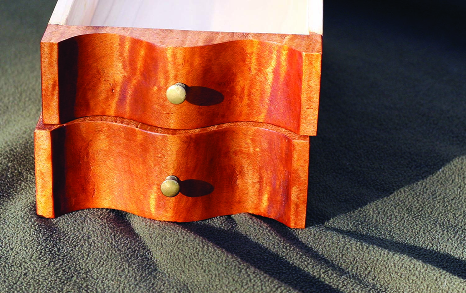
Reflection. Note the play of light and shadow on these small drawer fronts.
There are several ways to break this up. When assembling a composition with multiple curves, consider alternating convex and concave surfaces. You can also interject flat surfaces between the curves to act as punctuation or a border between one curve and the next.
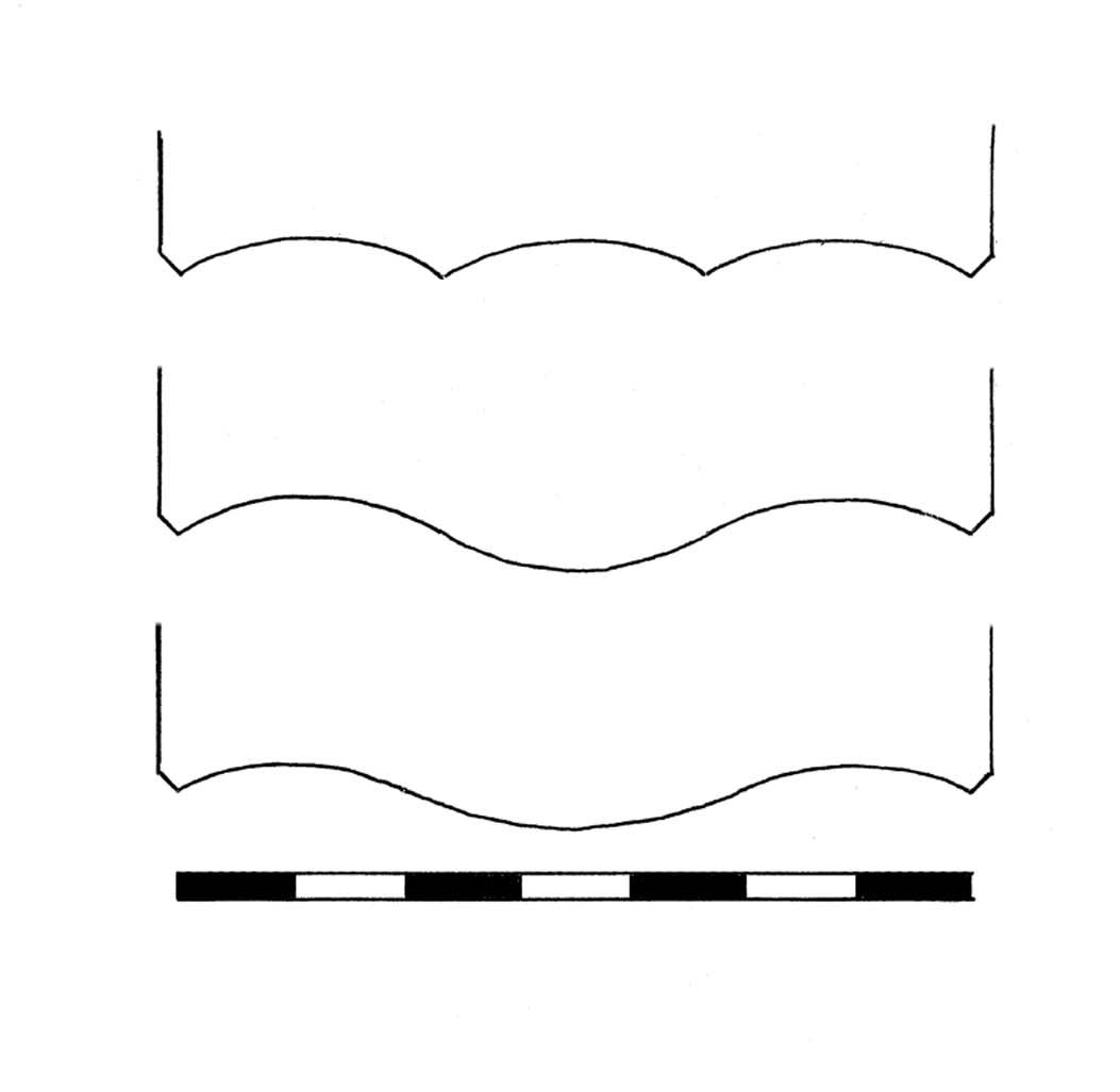
Most appealing? Experiment with curves on a dresser or sideboard. Which of these looks best to your eye?
Another way to liven it up is to organize the curves into major and minor parts. Above right are some profiles for the front of a dresser or a sideboard (the view is looking down). The top example simply divides the façade into three equal parts with three identical curves. The middle version divides it into three equal parts but alternates concave and convex. The bottom example divides the façade into seven parts, giving three parts to the major convex curve in the center and two parts to each of the flanking concave curves.
Which profile looks best to your eye? On the last example my use of the ratio 2:3:2 to create a major-minor sequence was arbitrary, but I find it’s helpful to work with simple whole-number ratios when searching for a combination that flows. Also, as you experiment with simple ratios you’ll begin to build a working library in your mind of how curves work. This is especially helpful when you study curvature in a furniture masterwork or in nature, allowing you to unpack it visually and climb inside it.
Apply it on a Micro Scale
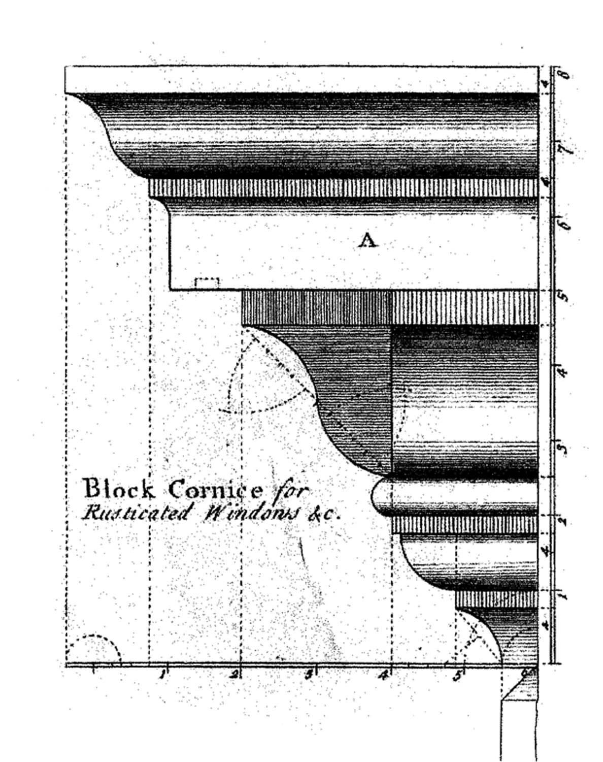
No monotony here. This lively cornice composition uses simple curves to create a dramatic border.
The same concepts apply on a smaller scale when combining the curved elements in a moulding profile. A lively composition alternates convex and concave, and it separates curved profiles with flat surfaces (fillets). Additionally, elements are sized into major and minor. Note how many curves are used in the cornice moulding above and how each element is scaled in relation to the adjoining element. This is a complex profile but also note that you could separate it into several smaller mouldings, each one able to stand on its own.
I hope this inspires you to venture out on that curvy highway. Who knows what discovery is just around the next bend!
Here are some supplies and tools we find essential in our everyday work around the shop. We may receive a commission from sales referred by our links; however, we have carefully selected these products for their usefulness and quality.


