We may receive a commission when you use our affiliate links. However, this does not impact our recommendations.
Last week I started down the slippery slope of defining some of the differences between the various periods of furniture (read it here). This week, I’m just jumping off the cliff.
Even if you’re not into period furniture, this series of posts can help you understand where your style of furniture came from. The whole idea is, everything is based on what has come before and everything is recycled somewhere.
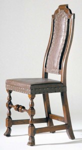
Picking up from where I left off last time, the introduction of the cyma curve dramatically changed design. It picks up the rake, or angling, of the back in relation to the seat but adds a bit of flair and comfort to the design as well.
Another difference, one I didn’t get to talk about last time, is the shift from a closed back to an open one. The backs of the chairs are consolidating towards the middle. Instead of a solid panel connecting the rear legs, there’s some open space between them and the part you lean against when seated. This is an insinuation of things to come – the splat.
There are a couple of things that happened as style moved from William & Mary to Queen Anne. First, the lower back rail moved down on top of the back seat rail (there’s no longer a space between the seat and the back). Second, if you look at the crest rail on the first chair in the post, you can see the shape transitioning towards the rounded corners of the Queen Anne chairs (as in the second chair in the post…that crest rail is often called an “ox yoke crest” because it looks like…wait for it…the yoke on an ox cart).
 You’ll also notice the consolidation of the back is complete with the inclusion of the solid splat. You are also getting some Asian influence in the splat with the urn shape. The cabriole legs and compass seat pull more curvaceousness into the design.
If I were to sum up the difference between William & Mary and Queen Anne in just a few sentences I would do it this way. On Queen Anne chairs the cyma curve not only added grace but comfort. Craftsmen at the time ran amok with curves – adding them to the shape of the seat and legs as well. They tightened up the look of the back by bringing the back rail down on top of the back seat rail (it also changed names and became the “shoe”). The chairs lightened in appearance with a consolidated solid splat and a curvaceous crest. In a word Queen Anne is curvy.
 Once started down this road, it didn’t take long (a couple of decades or so) before someone lightened up the look a little more by piercing the back splats and adding a bunch of carving – enter Thomas Chippendale.
Okay, so he didn’t invent the style even though he published “The Gentleman’s and Cabinetmaker’s Director” in 1754 showing what he purported to be “a large collection of the most elegant and useful designs of household furniture in the Gothic, Chinese and Modern taste.” What began with Queen Anne reached its peak with Chippendale – the China trade.
Let’s face it, more people traveled and were exposed to various cultures that influenced the things they had to sell to those who didn’t travel. If every merchant in town is selling local goods, and you have access to goods from halfway across the globe, you have a marketing angle.
For our purposes, however, we need to look not at the economics but the design changes that came about from Chippendale’s best seller. Punching holes in the splat did lighten things up but it also allowed the makers to adorn them with carved vegetation. This is a result of not only bringing in Chinese, Greek and Roman influences into the furniture but French – enter Rococo.
In the Chippendale chair on the above left you can see the Asian influence on crest rails. Notice how the overall design of the crest has a similar look to the roof of a pagoda. This creates “ears” on the crest (unlike the ox-yoke crest of Queen Anne) – another telltale sign a chair is Chippendale in design. The feet on the same chair are called French scroll feet and you can also see the acanthus leaf carving on the knees of the legs. That little bit of rope carving around the bottom edge of the seat rails is called gadrooning.
Using the same summation style as I did for Queen Anne furniture, Chippendale chairs have eared crest rails and pierced back splats. Some still have cabriole legs but straight legs were what Chippendale would have considered the most fashionable (but Americans stuck with cabriole legs even though the fashion had changed considerably in England). You’ll also see lush vegetation carved into the various elements as well as bits of Gothic and Asian architecture adapted into the designs.
In the next “Design in Practice” post I’ll drag us through the Federal period all the way into the beginning of the Industrial Revolution. There’s lots of ground to cover in a very narrow vein. When all this is done and we get back to comparing designs, I’ll point out some of these characteristics on other forms as we go. Even with these encyclopedia sized posts I’m only scratching the surface of design so, be sure to post your questions in the comments (or you can email me by clicking on my name below).
Here are some supplies and tools we find essential in our everyday work around the shop. We may receive a commission from sales referred by our links; however, we have carefully selected these products for their usefulness and quality.


Planning a trip east in the fall. Which museums in the Williamsburg area to Boston would you recommend for someone with an interest in period furniture? The following from Williamsburg south.
Chuck.
You touched on the American stylistic variations. That is a field of study all to itself! Beginning in the Queen Anne era, regional differences started to show up. They were fully realized in the Chippendale era. The most obvious was the influence of the Goddard and Townsend workshops in Newport, CT. The New York, Philadelphia and Boston “schools” all had signature stylistic differences that can be traced to prominent individuals or groups of architects / designers / craftsmen.
Thanks for this series! I’m enjoying it very, very much.
This series is really something I look forward to from one installment to the next. Very useful. I, too, like construction details as well as design elements since they are often so closely related. Thank you and keep them coming!
This is a very interesting series and I am enjoying it. I hope we can look at the construction a bit more as you did in the post about chairs a couple weeks ago. Are the row of tacks in the W&M chair are a sort of gadrooning feature as well?
Ask for a pay raise.