We may receive a commission when you use our affiliate links. However, this does not impact our recommendations.
Unlike other furniture designers, I have a handicap. When I design something I am burdened by 15 years of designing furniture for a magazine audience.
During those years, I sought to simplify construction and ornament on every piece so that we could fit it into a six- to eight-page article in the magazine. That meant doing away with details that no one saw, designing joints that required the fewest number of changes to your tools’ settings and looking for efficient ways to use simple details throughout a piece.
At first, I thought I was dumbing down designs for the lowest-common denominator of woodworker (and it’s possible that I am guilty of that). But after several years of working at the magazine, something became obvious to me: The more effort I put into simplifying and streamlining a design, the more likely people were to build it.
And that was the point: Inspiring people to pick up the tools and build things is better than impressing people with your technicality and maestro-like swoopy thingys.
So I embraced my inner Spartan, and I consult the dude even when I design furniture for customers.
The following is my Spartan’s take on the ornamental details of this chest.
The Pulls
It would be easy to find some contemporary pulls that would work OK on this piece. It would be expensive (but fairly easy) to get a blacksmith or whitesmith to make some Danish Modern campaign pulls that looked like those from pieces designed by Borge Mogenson or Kaare Klint.
But that’s too easy. How could I design pulls that accomplished the same goals as the Danish Modern designers: create something contemporary that stands on the shoulders of great historical designs?
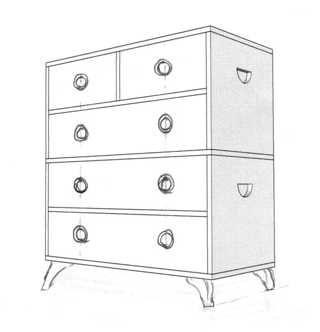
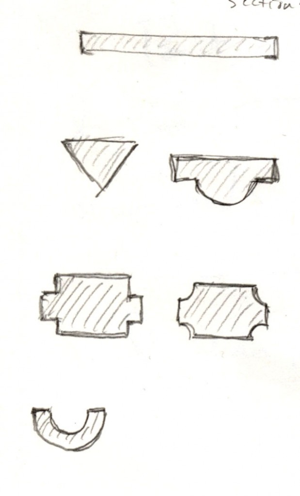
I like how the Danish Modern wooden pulls pierce the drawer fronts – they don’t just sit proud like some hardware. So I started sketching different shapes that could be a cut-out in the drawers and act like a pull. I played with a bunch of shapes, from a simple circle (a cut-out shape I’ve used on pieces before) to other shapes:
Triangle: Mock-ups of this shape tended to bunch the fingers too much unless the triangle got really big.
Rectangle: I liked this shape, but it looked like early Cylon to me.
Rectangle and half-circle: Looked like a wart.
Half moon inside a half moon: Looked like a smiley face.
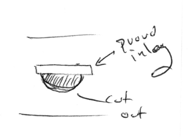
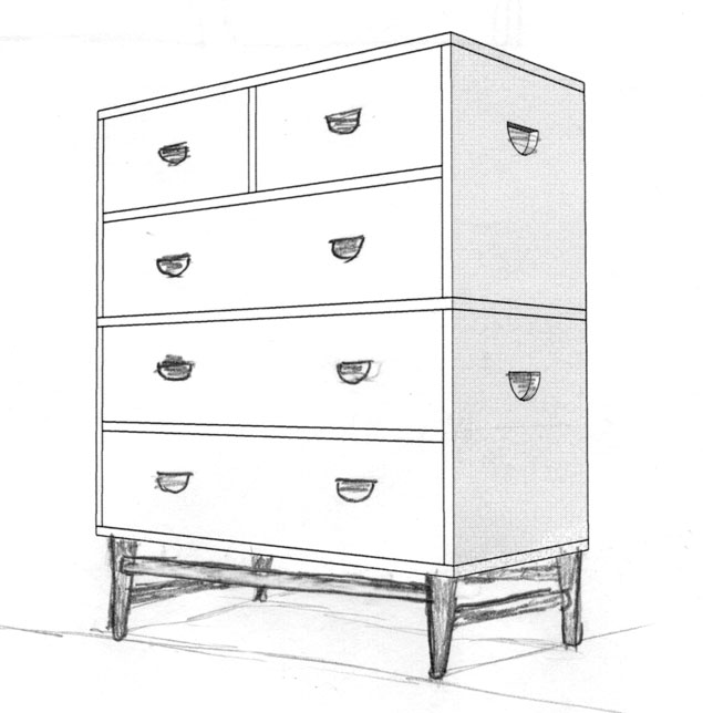
And so on. I sketched dozens of shapes before settling on a simple half-moon. This looks like a Tansu pull and shows up on some Danish Modern pieces by Kaare Klint in brass. What I liked about the circular section is it looks like a pull dropping down from the straight line. Perfect.
But this is only half of the problem. Do I really want to have drawer fronts pierced by cutouts? I can see people’s underwear sticking out of the pulls. Yikes. (Or: Very Cool.)
So I did two things: First, I decided to relieve the interior of the cut-out with a chamfer or cove bit (in a router) so you could get your fingers in there easily. Then I decided to back the cut-outs with a sheet of brass. The brass would suggest a typical backplate for a piece of hardware and would match another brass detail I have yet to discuss.
That completed the design of the pulls.
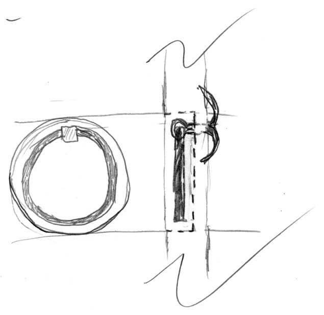
But one of my sketches for a pull was so charming that I set it aside for a future piece. It was a counterbored hole in the drawer front with an iron ring pull from Lee Valley. I’ve used these on dozens of projects and love them. Making them recessed into the drawer front seems a cool way to get inexpensive flush hardware with lots of shadow lines. And easy access.
Ideas like this are why I keep all my sketchbooks. You never know when a good idea from 10 years ago might come in handy.
OK, I was going to write about the plinth, but this is getting too long. Next time we’ll deal with the plinth.
— Christopher Schwarz
Read part 1 of this design series here.
Part 2 is here.
Part 3 is here.
Here are some supplies and tools we find essential in our everyday work around the shop. We may receive a commission from sales referred by our links; however, we have carefully selected these products for their usefulness and quality.




Storing sketchbooks is a great idea (unless you leave it at a lumber yard on a very sad day), but I find I sketch on everything and usually my best sketches are on random post-its or corners of meeting documents/notes. Have you found an effective way to electronically archive? I seem to loose “something” with just photographing and then how to organize? I’ve sort of used “One Note” for this but not gone all-in.
“I sought to simplify construction and ornament on every piece so that we could fit it into a six- to eight-page article in the magazine.”
It needn’t be so. Our attention span is longer than a single issue. Woodenboat and Watercraft magazines both have design and construction series than run for months, sometimes more than a year. I’m sure that furniture makers are as patient as boat builders.
Nice pulls. I’ll definitely use the last one. Thanks.